Clinical Structures (POC)
2023
Project Overview and Background
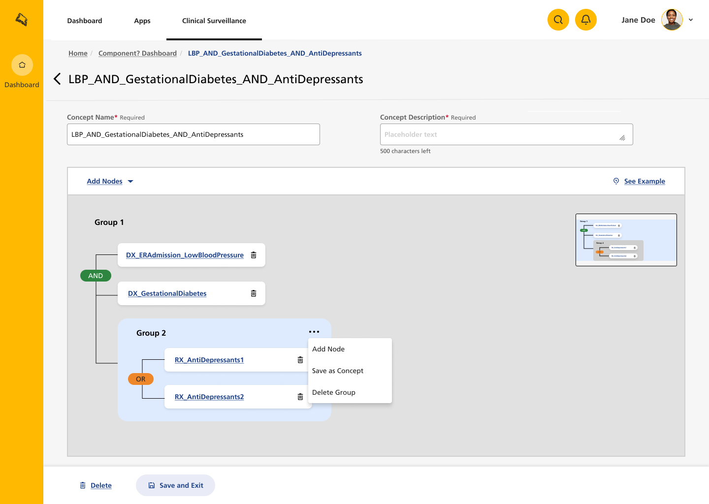
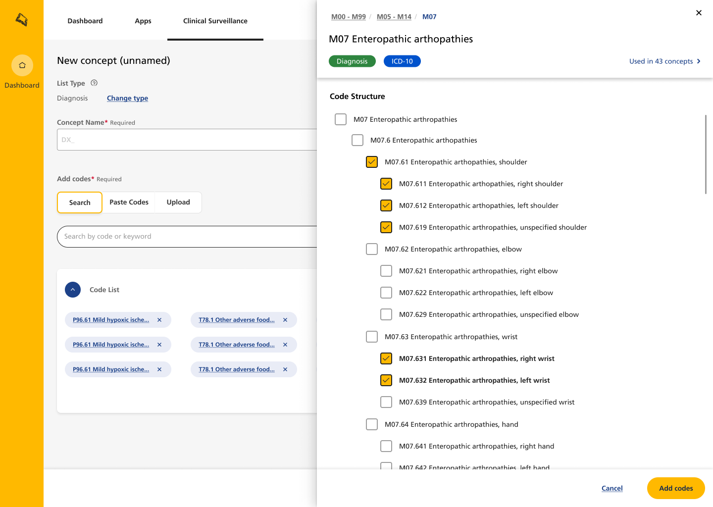
Clinical Structures (also known as Clinical Surveillance, CS) was a proof of concept that I redesigned as a production level application. CS combines clinical codes and demographic criteria to identify populations for preventative treatment. Up until now, the clinical logic had been created in-house by specialised teams using black box coding methods. The goal of the CS product was to make this information accessible to non-technical employees, thereby allowing users to identify at-risk members (patients) using real time data.
Our initial milestone goal was to create an MVP version of Clinical Structures to release to a large number of users for usability testing.
My Role
I was the sole UX designer on this project, and also took charge of the content design as part of the effort to create an intuitive user experience for a fairly complex idea.
Based on the research I conducted, I designed the navigational structure of the site, created user personas and content style guide, and wrote UX copy, such as notifications, informational messages and empty states.
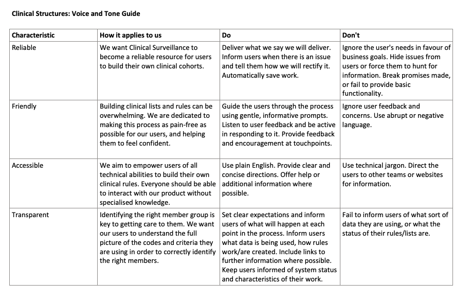
Voice and Tone Guide
Research
The intended end users of this product were of two main types and were on opposite ends of the spectrum in terms of technical knowledge:
Business users who did not have advanced - or sometimes foundational - coding knowledge
Clinical coders who were experts in SQL and clinical codes
This meant that the design had to guide novice users, while also giving freedom to expert users and not over-simplifying the tool for them.
During my conversations with the users, I identified several important points that could lead to user dissatisfaction if not addressed:
Clinical coders were concerned about the usability of the tool and whether it would slow them down and/or allow them to be as detailed as they were when writing code
Business users were excited about the possibility of creating their own clinical rules, but nervous about their understanding
All users expressed both curiosity and trepidation about access and whether others could edit or interfere with their work
Creating the Guide
The findings outlined above suggested to me that two of the most important values to the users were transparency and reliability. Additionally, I felt that if the product’s voice had a friendly voice it may help to reduce nervousness in users. Extra attention should be paid in creating empty states, signposting and breadcrumbs, and documentation.
In the guide, I outlined how these values should influence the product’s voice, and gave some examples of how this should and shouldn’t be applied. Some of the “Do’s and Don’ts” might seem obvious, but oftentimes having this information written down can help to reinforce it and help the team hold themselves accountable.
Example #1: Empty States
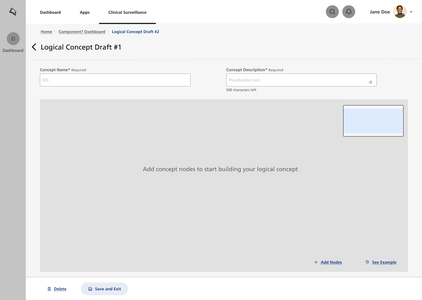
In my experience, empty states are one of the most neglected features in product design, despite how impactful they can be for the user. I view them as opportunities to provide information, context, and, perhaps most importantly, to show the user that we care about their experience.
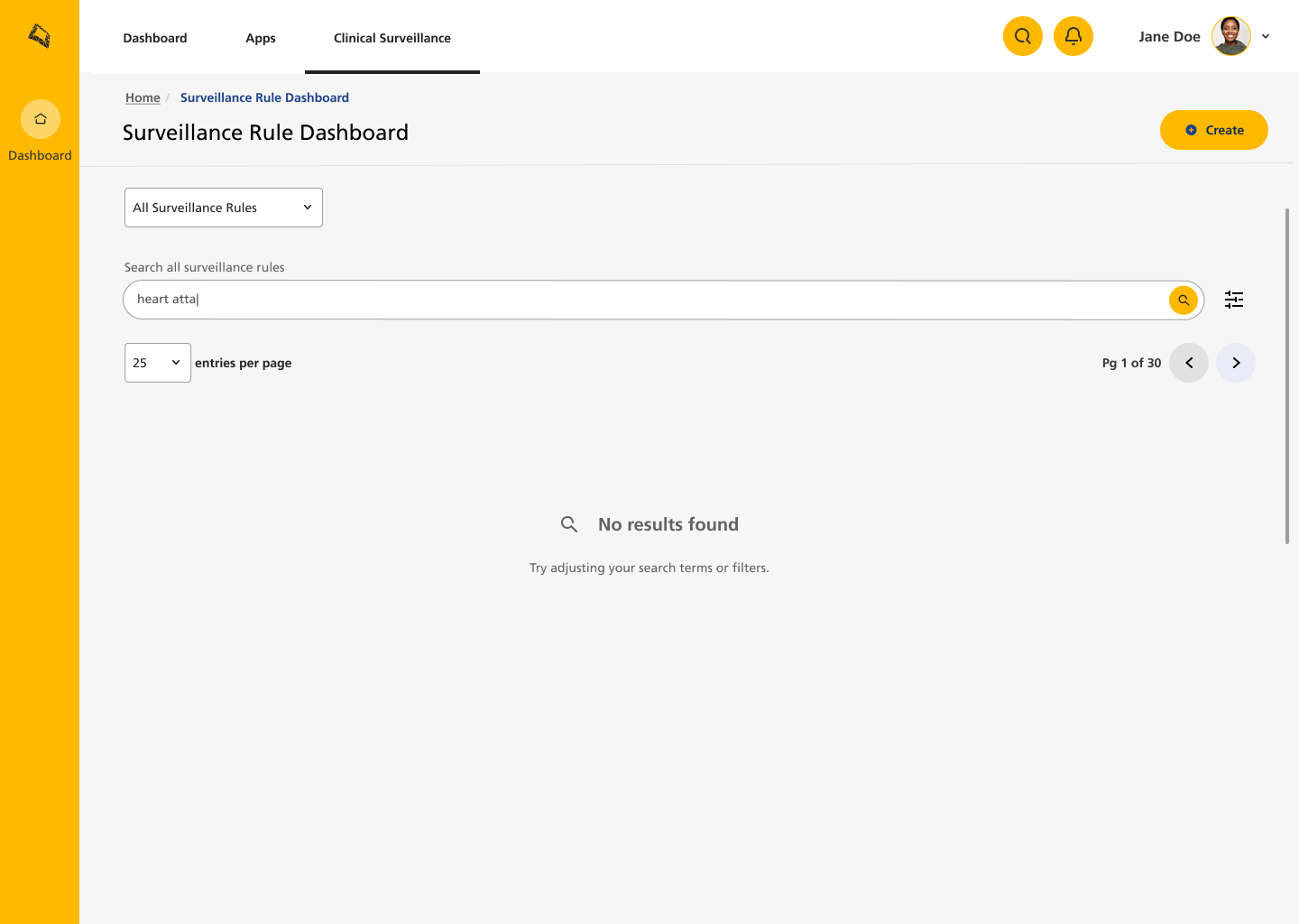
As part of my work on this POC, I examined the user flows, looking for points that would require information, clarification, or guidance to help the user achieve their goals. Most empty states solve a problem or answer a question, even if this is minor. For example, I added copy when the search feature does not yield any results, advising that they recheck the terms they used.
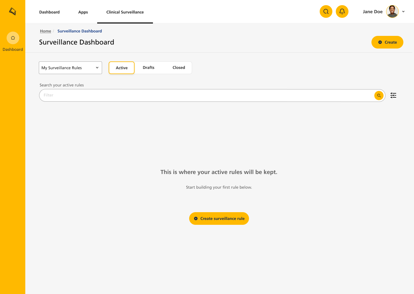
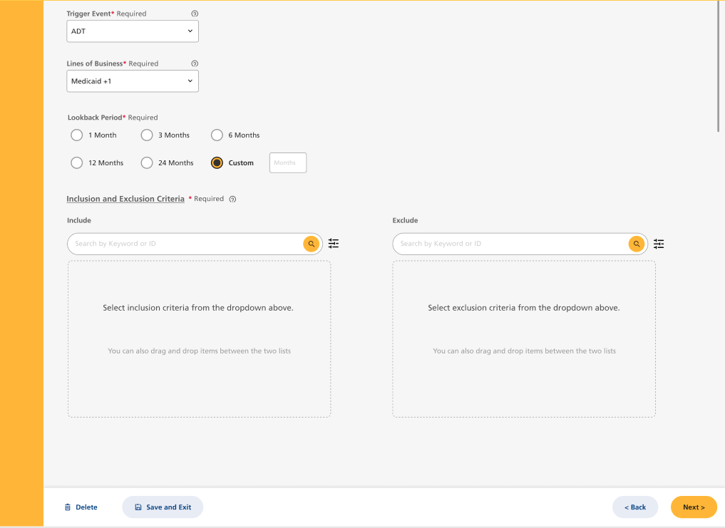
Others empty states I created include a clear CTA to help the user to get started in a new flow, such as rule creation (see slideshow below). This was useful because we were bringing into existence a fairly complex system, and adding progressive disclosure and informational points in the empty states would help guide the user through how both the system and the concept itself worked.
You can view examples in the slideshow below.
Example #2: Errors and Warning Messages
As I’ve mentioned elsewhere, one of my frustrations as a technophile is error messages that misguide the user and cause them additional stress while trying to discover the real issue themselves. Given the complexity of the Clinical Structures product, I wanted to cover three common issues:
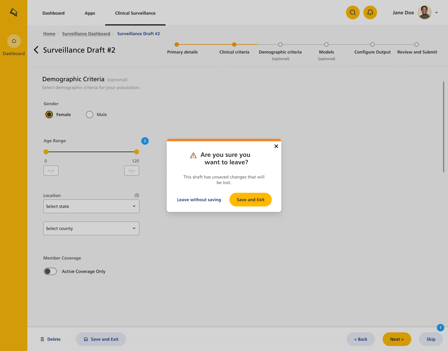
User slips - preventing users from unintentionally performing actions that may result in an unwanted outcome. For example, allowing them to review an item before final submission.
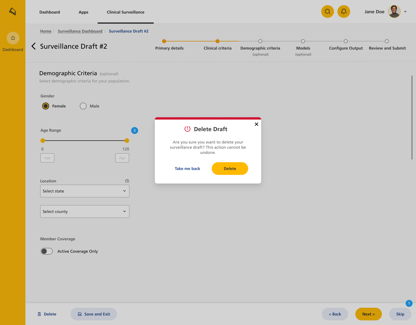
User mistakes - preventing the user from intentionally performing an action that they cannot easily reverse. For example, asking the user to confirm that they want to continue with a destructive action, like deleting an item.
System errors or user errors - informing the user as to why the system is not performing as expected, which reduces stress and anxiety.
You can view examples in the slideshow below.
Example #3: Informational copy
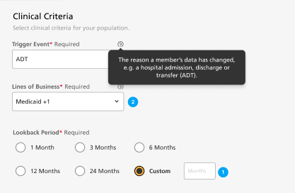
To my mind, informational copy is everything that helps to guide the user through a product and reassures them that it is working as expected. Some examples that I created here include:
Feedback to let the user know an action had been completed
Clarification of technical or clinical terms
Clear navigation and menu items
Clear labelling of buttons and CTAs
