Clinical Data Reporting
Project Overview and Background
Over the years, numerous dashboards and digital reports containing clinical reporting data have been built in isolation for a variety of business users. Many of these reports contain similar, but slightly different, combinations of data to account for these different users, meaning that there is a lot of duplication and slight variation between reports.
My Writing Process
In many ways, my UX writing process is similar to my UX design process - it all starts with empathy.
Understanding the user is the key to good design and good UX copy. Only when you understand your user and meet them where they are can you aid them on their journey.
My process starts off with deep research - getting to know the types of users, what they expect from a product and what they need to achieve their goals. With digital products, it’s also crucial to learn their level of technical knowledge and understanding, so we don’t over-explain or under-explain.
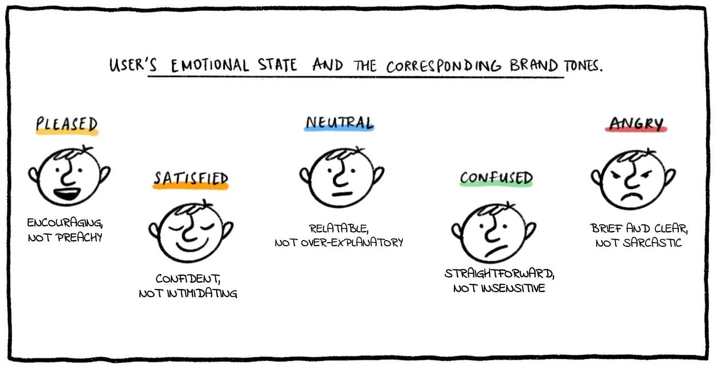
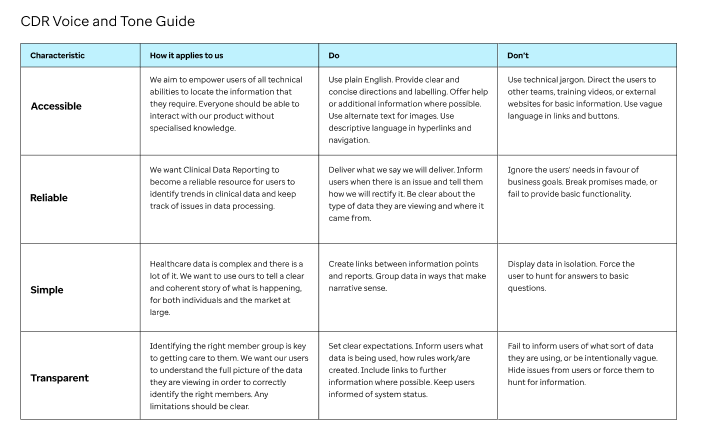
Based on the research, I create a voice and tone style guide to help direct myself and others working on the project. A consistent voice helps provide comfort to the user and gives the appearance of product reliability and trustworthiness. It also helps to create an emotional connection with the users; as humans we are affected by our interactions and are less likely to trust an inconsistent personality, whether it is an individual or a business.**
When testing UX copy, I have found that it is great to get information in front of users as soon as possible. There are also apps that I have found useful, such as the Hemingway App, that can be used to check grammar and readability of the copy.
**Professor Clifford Nass from Stanford did some interesting research in this area.
My Role
I was the Senior UX/UI designer on this project and was given the challenge of combining numerous dashboards and reports into a single product, while also uplifting and modernising existing reports. I also took charge of writing UX copy.
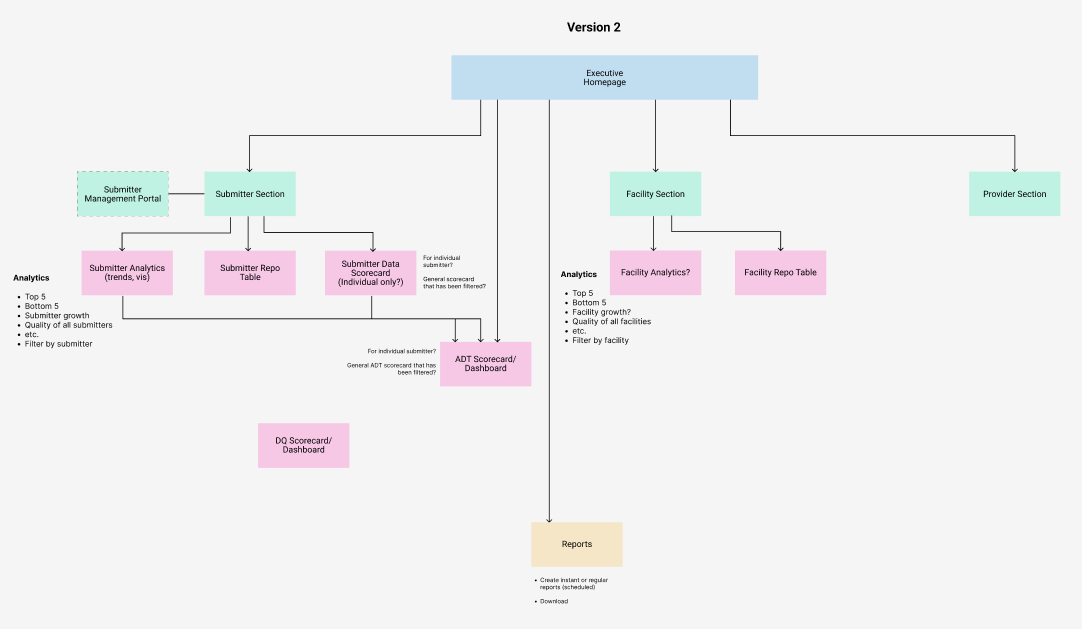
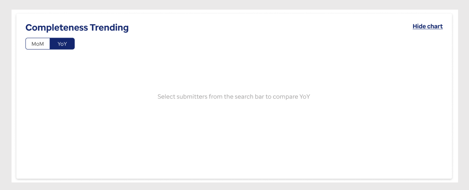
As part of this, I designed the information architecture and navigational structure of the site. I also created the user personas and content style guide, and wrote UX copy, such as notifications, informational messages and empty states.
Style Guide
As I mentioned above, a consistent product voice helps to create an emotional connection with the user. The early research I conducted in discovery helped me to understand what was important to the users and what they expected from our product.
Reliability of data in CDR is of the utmost importance, as is the transparency of our communications with users. Our users come to the product looking for answers to their questions and need to find these answers quickly; doing so means that they can intervene in patient care at crucial points.
Given that the users’ intentions are straightforward and no-nonsense, I felt that our product’s voice should be the same. Using the top characteristics that came up regularly in discussions with the business, I outlined how these characteristics apply to us and created examples of how this might look in action.
Example #1: Information Architecture
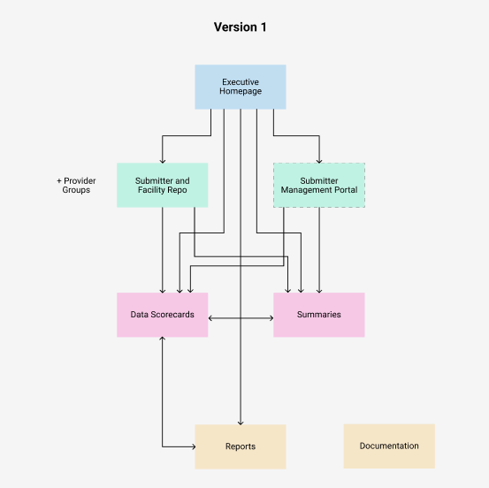
The initial vision of our reporting product was to create a layered information system. The top-level reports had the highest level details, intended for executive users. As the user follows the information scent, they can move down to progressively more detailed reports. User research confirmed that this was how they would interact with the reports.
However, research showed that users would likely want to go directly to their reports rather than start at the executive reports every time. Therefore, I added navigation to the platform, working with users to group the information into navigational categories.
In addition, I added breadcrumbs to each dashboard and report, meaning that the users could easily traverse high-level/low-level reports within the same category.
You can view examples in the slideshow below.
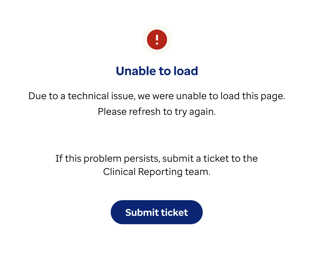
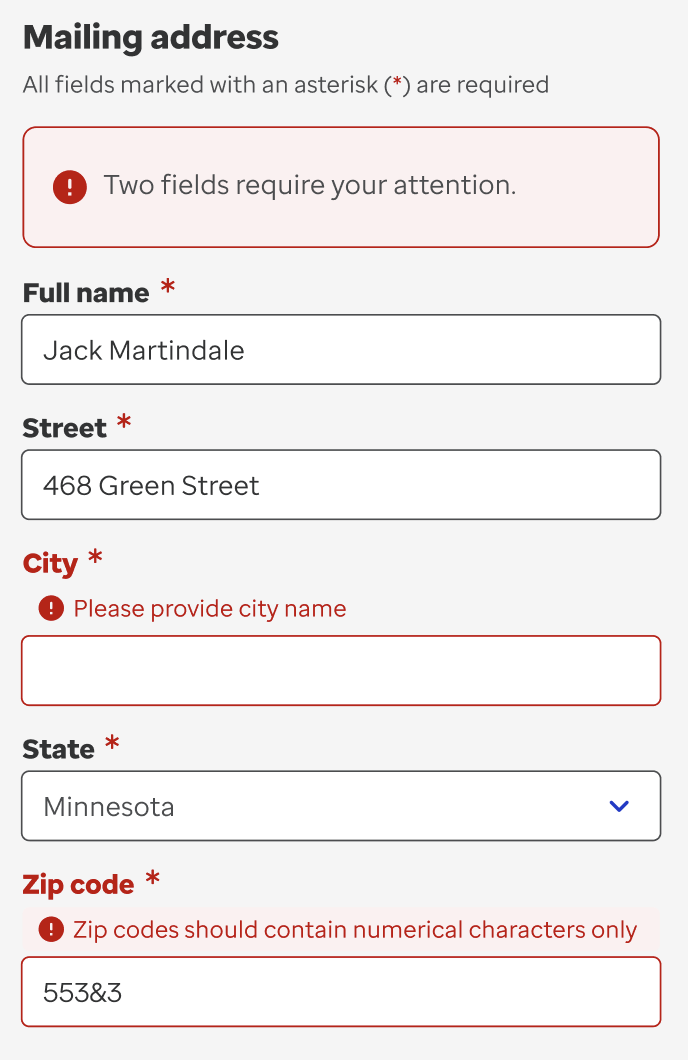
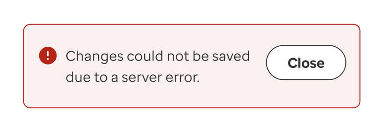
Example #2: Error Messages
A pet peeve of mine is the use of error messages that highlight the wrong problem - I’ve come across these a worrying number of times on websites and apps. It also appears that the user’s feelings and concerns are not being considered; errors and mistakes can cause unnecessary stress to a user and lead to them not achieving their goals.
To avoid ambiguity and stress, I wanted to be sure that we had error messages that informed the user:
a) what was wrong,
b) if they could take any steps to rectify it, and
c) what those exact steps were
Sometimes the step is to do nothing or simply refresh the page, as it is a system error that the user cannot solve. Other times, the error is as a result of user input or an attempt to perform a destructive action.
You can view examples in the slideshow below.
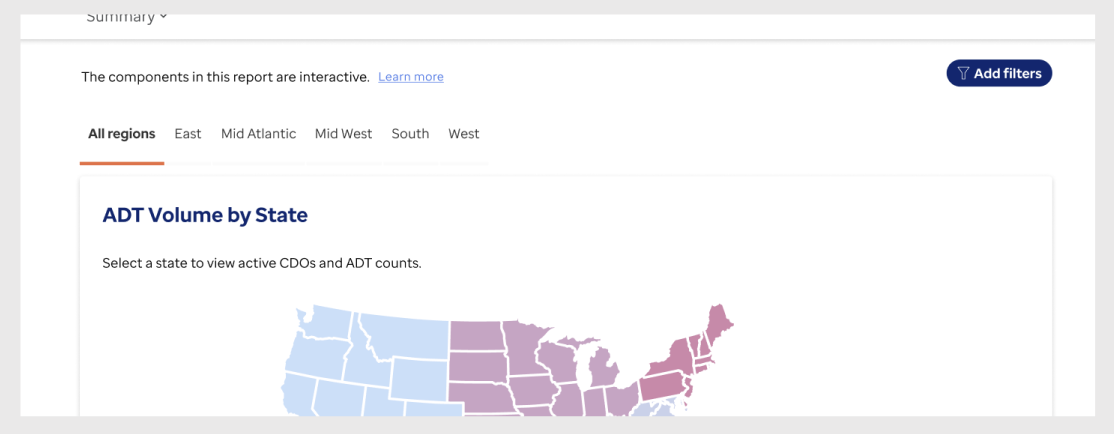
Example #3: Informational Messages and Empty States
These reports are data-heavy, meaning that they take some time to load. They are also frequently updated as new data becomes available, meaning that there are regular changes to the product.
Due to the dynamic nature of the UIs, I felt it was crucial to keep the users involved in the process, letting them know when a change had occurred, or if an expected update was delayed.
Keeping with the style guide, I avoided using vague or coy language and instructed the user in clear terms about what actions they would need to take or how they could access additional behaviours:

