Clinical Surveillance
2023
Project Overview
Clinical Surveillance (also known as Clinical Structures, CS) was a proof of concept that I redesigned as a production level application. CS combines clinical codes and demographic criteria to identify populations for preventative treatment. Up until now, the clinical logic had been created in-house by specialised teams using black box coding methods. The goal of the CS product was to make this information accessible to non-technical employees, thereby allowing users to identify at-risk members (patients) using real time data.
Our initial milestone goal was to create an MVP version of Clinical Surveillance to release to a large number of users for usability testing.
Design Process
Research and Analysis
Stakeholder Interviews
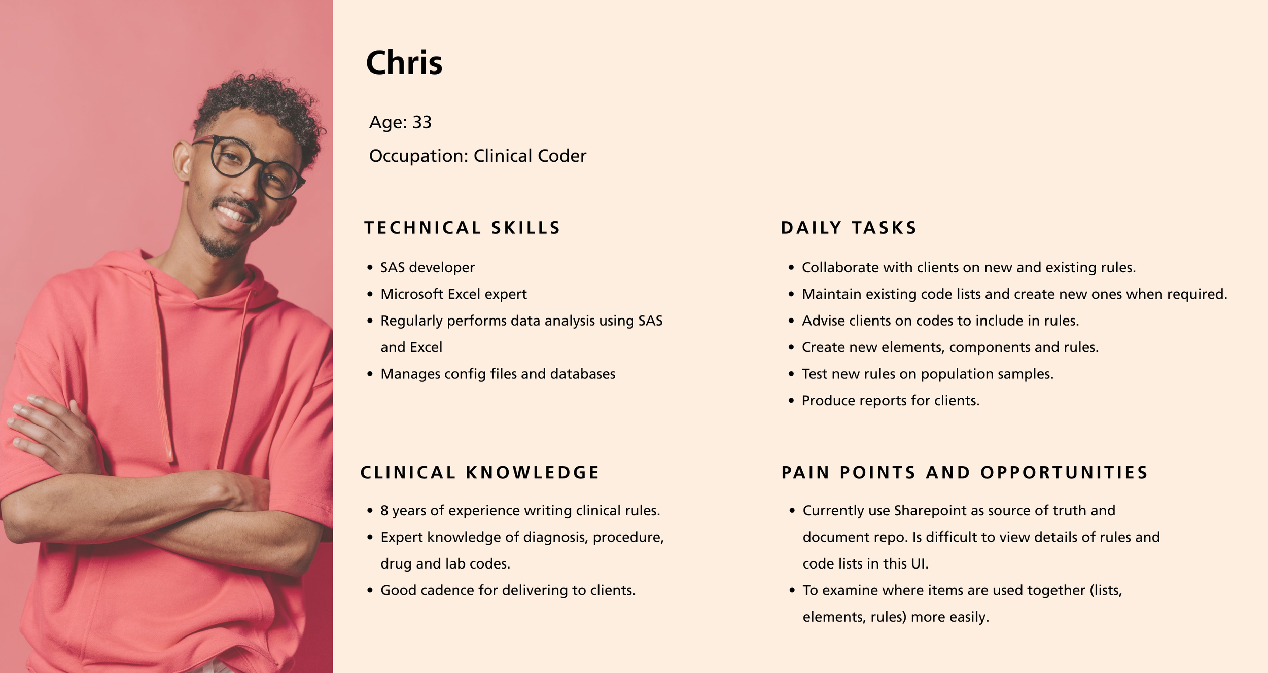
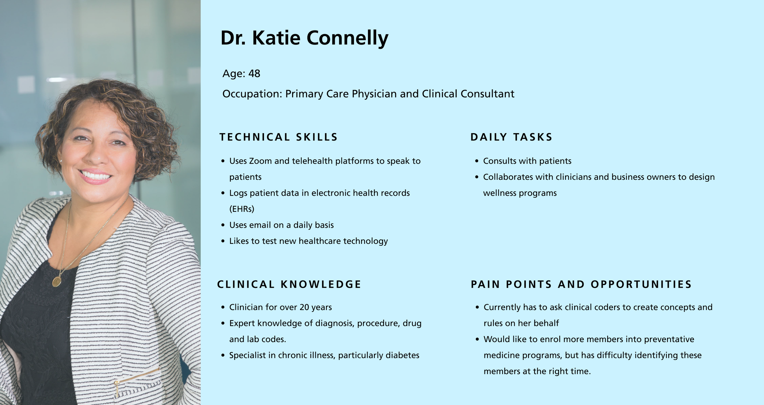
To better understand the users’ needs and goals, I reached out to a variety of stakeholders and experts who work within the clinical space, from clinical coders to product owners to medical doctors. I conducted 1:1 interviews and focus groups to learn the users’ current processes and pain points. From this, I was able to map out user flows and personas, as well as define some high-level user goals.
From these, I identified the following user groups:
Clinical coders/devs: the most expert users, who currently create clinical concepts and rules using SAS code.
Clinicians: doctors and other medical professionals who are experts in clinical codes and how they can be used in preventative medicine, but are unlikely to have in-depth technial knowledge.
Business analysts: have the least amount of clinical knowledge, and may or may not have in-depth technical knowledge. Will likely be creating clinical concepts and rules on behalf of the clinicians.
Mapping the User Flows
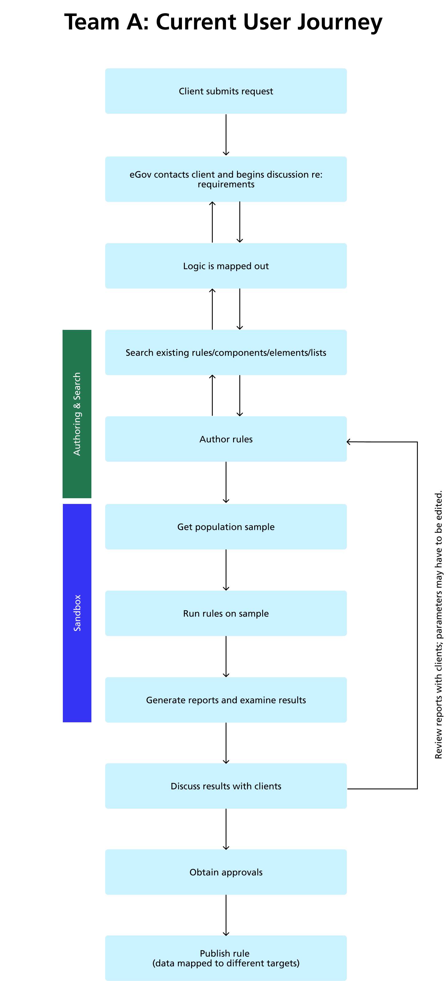
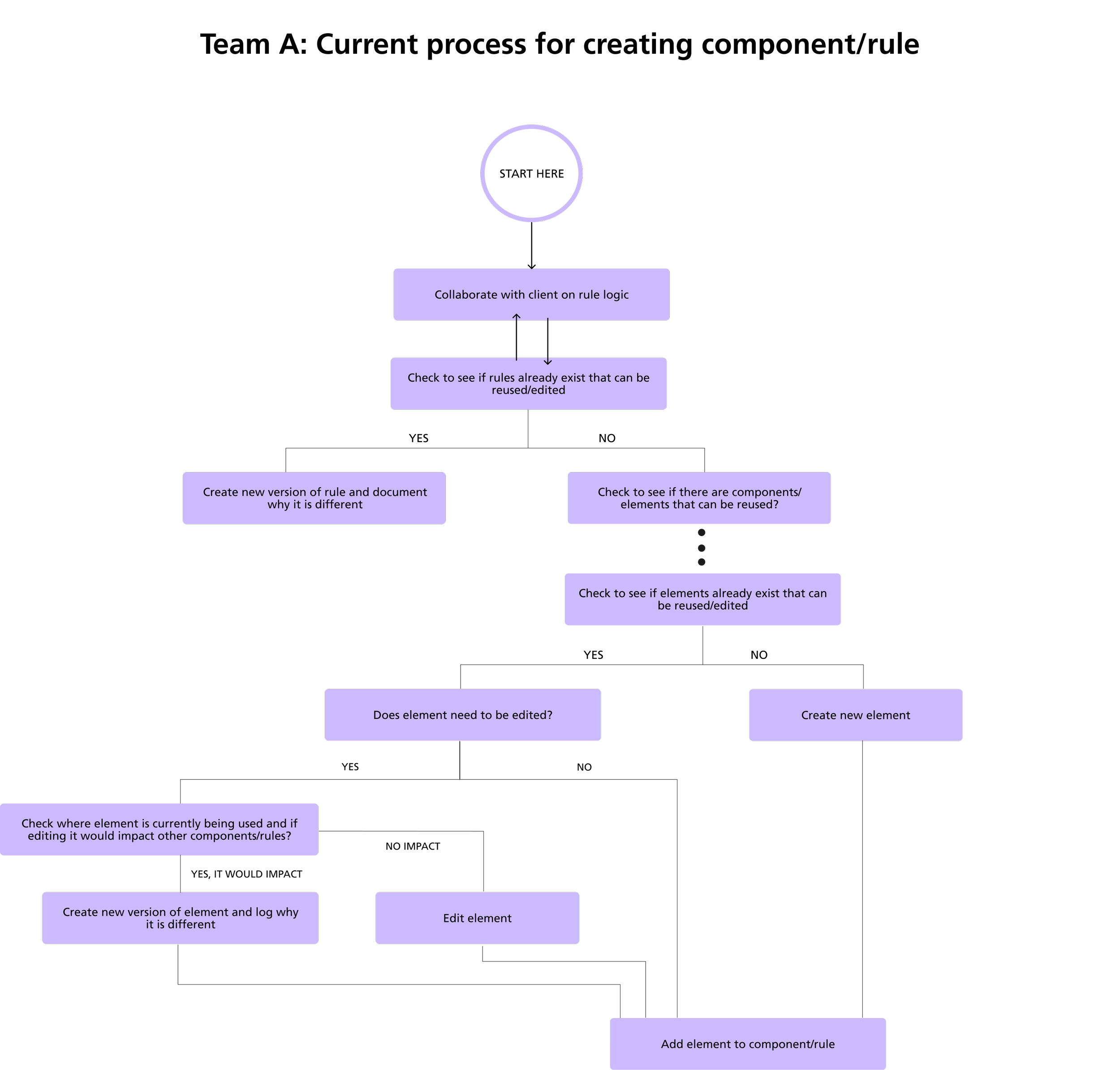
From the information gathered in my interviews with the users and stakeholders, I was able to map out the current user flows through which users create clinical concepts and rules. The flows were then validated by the users. These helped greatly in understanding the mental model of the users, as well as their needs and expectations from our tool in terms of functionality and data access.
The target audience of CS was wide, ranging from clinicians and business users with minimal technical experience, to clinical coding specialists who currently identify members using black box coding.
Expert users spend a lot of time fielding questions from business users
Have difficulty in viewing details of clinical rules without examining the code
Often don’t know when similar rules have been created, leading to a lot of duplication
Market Research
As this was a complex UI, I looked for inspiration from other tools on the market. Three examples that I found were SAS Health, Stanford Health, and TriNetX.
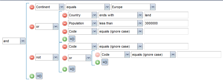
Both SAS Health and Stanford Health had clear interfaces that relied on tables, but did not use the visual component we were looking to create. TriNetX allowed users to set inclusions and exclusions for a query on the same screen, which was a great feature, but also didn’t use visuals. This was an area in which we could create something new.
Our users also needed a central space where they could keep track of the rules they had personally created, which none of these products appeared to have.
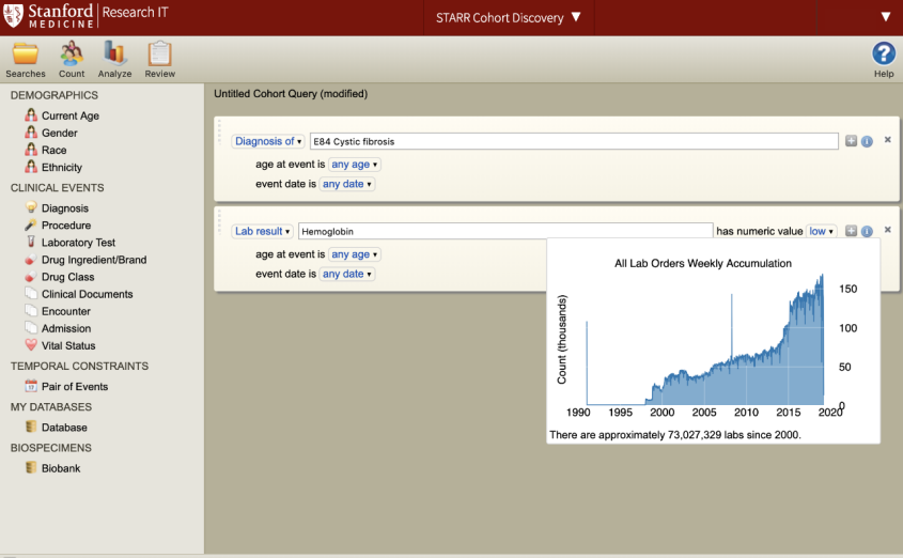
Stanford
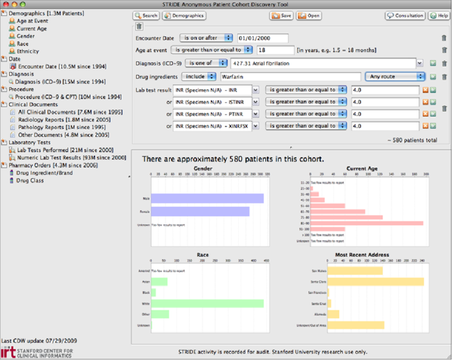
Stanford - detailed queries

SAS Health
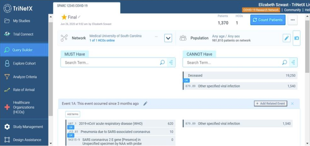
TriNetX query builder
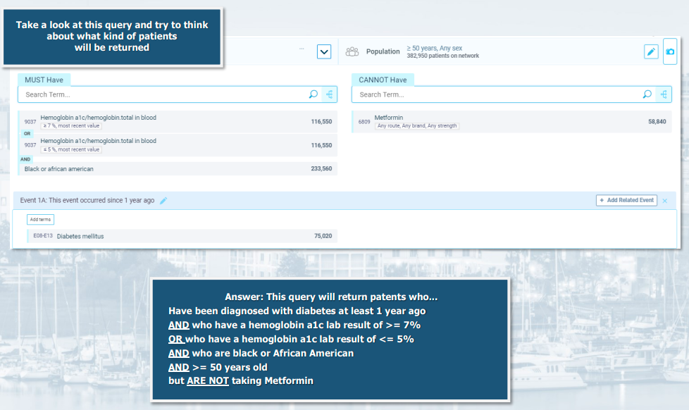
TriNetX query builder pt2
Designing the Solution
Technical Restrictions
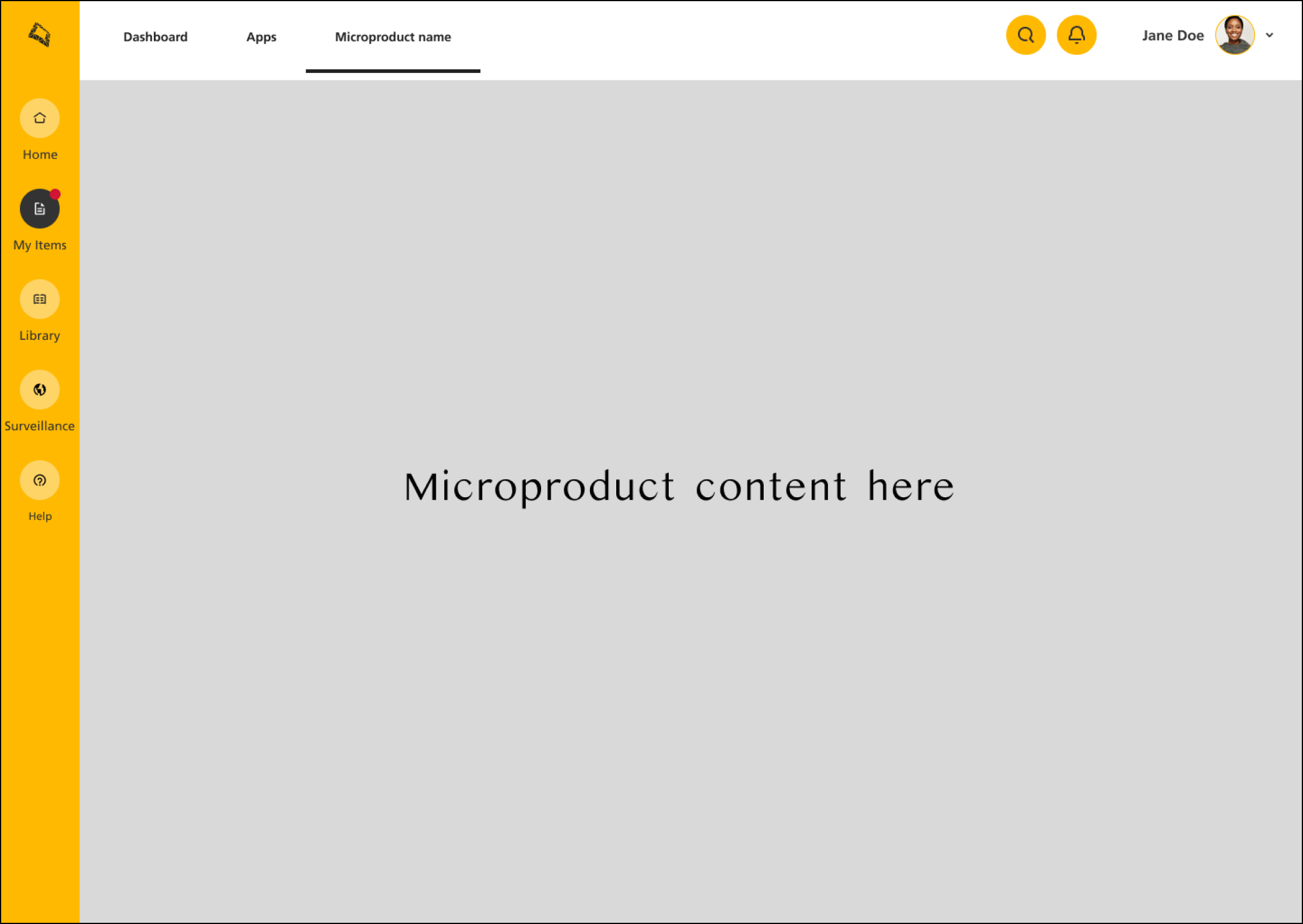
As CS was to be hosted on an internal platform as part of their clinical care management portfolio, the design had to adhere to the existing architecture and design system. This had implications for both the appearance of the UI, as well as the behaviour of the product itself and the design of the information architecture.
One example was that both the vertical and horizontal navigation bars were inaccessible to the microproducts, as they were controlled by the host platform. Another was that the design system being used on this platform was in its infancy, and hence did not have a lot of components. This gave me freedom to create quite a lot of features from scratch, which went on to be added to the design system later.
Information Architecture
Based on my research, I deduced that the required functionality could be broken down into three main areas:
Creation of codeable concepts (lists of healthcare codes. These can be diagnosis, procedure, lab or drug codes)
Creation of logical concepts (code lists combined together using Boolean logic)
Creation of clinical rules (using the previous two components, combined with other clinical criteria and demographic data, to identify members who fit into a specified population)
All of these components can be created independently of one another, promoting reuse of components and helping to direct user groups based on their needs.
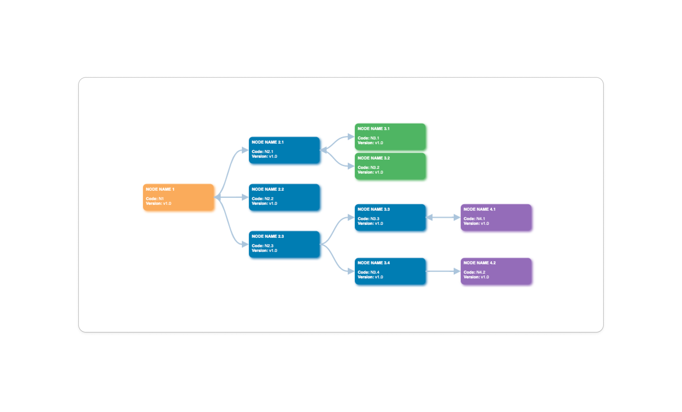
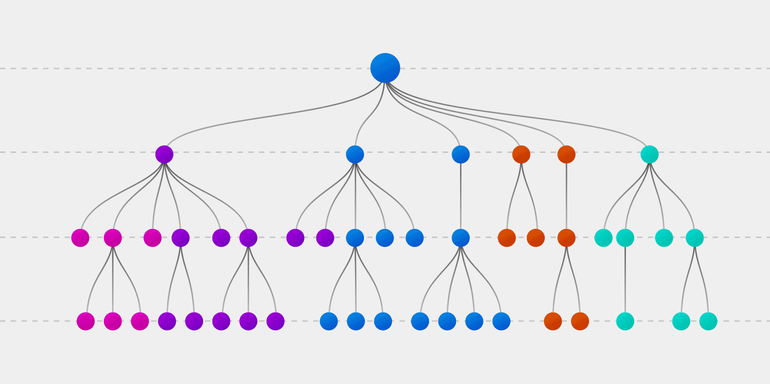
Given the complex nature of logical concepts, we posited that the use of visuals while building them would be useful in aiding less technical users.
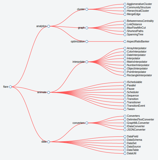
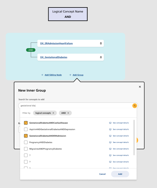
As well as conducting market research into query builders, I researched different types of visualisations using design platforms such as Dribbble, and software libraries compatible with Angular. Tree visualisations seemed the most appropriate given the complex and/or logic that is used in clinical coding, and I chose to use collapsing trees accessible in a d3.js library. In this, nodes can be hidden within parent node, allowing the expansion and contraction of more detailed views when necessary.
Visualising Complex Logic
In creating the product’s IA, I worked with a variety of stakeholders to identify the key user flows, including:
Creating new codeable and logical concepts
Creating new rules (using concepts)
Browse database of concepts and rules
Keep track of results from rules in use
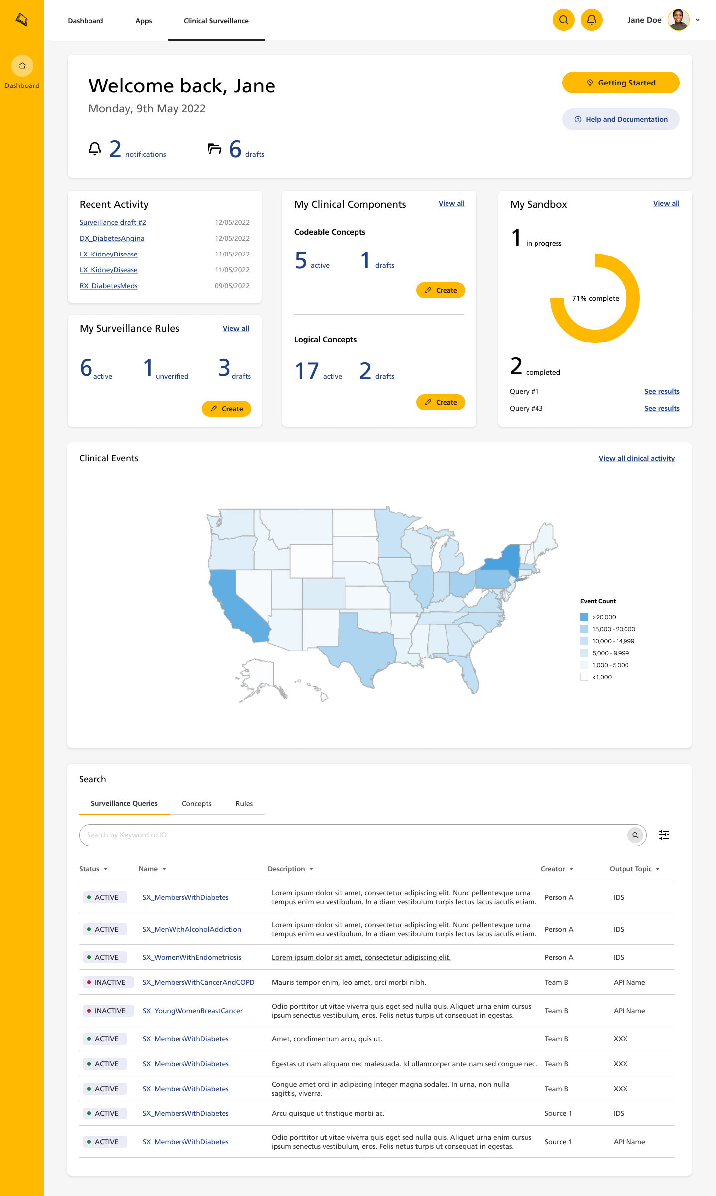
To help users keep track of their work within the different areas, I created separate ‘home pages’ for each of the three core components that users can create (codeable concepts, logical concepts, and rules), where they can view active and draft versions of their work.
Design Iterations for MVP
As I moved from ideation to design, I had regular feedback sessions with users and stakeholders to review flows and lo-fi wireframes, as well as to gather further details related to data and procedural restrictions.
Our user types ranged from clinical coders to business people with basic technical knowledge. As such, the interface had to enable expert and novice users to intuitively create and run clinical rules from scratch.
The user interviews also uncovered some clear must-haves for our product:
Ability to quickly and easily search through a massive amount of data to locate the correct codes.
Ability to customise concepts, e.g. add lab threshold scores
Allow duplication and reuse of rules and concepts
Be simple and intuitive
Below are some examples from the design iterations.
Home Dashboard
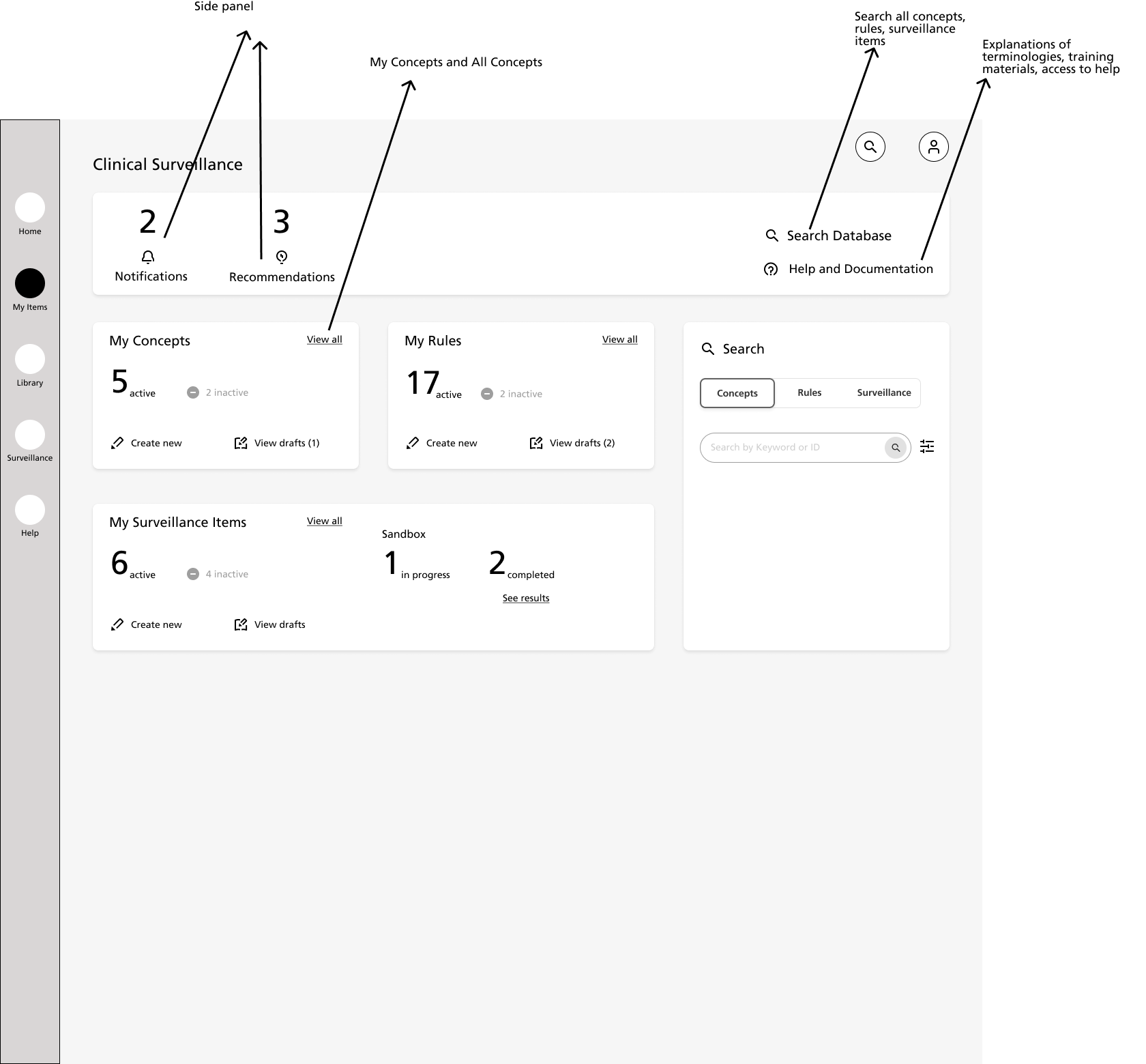
As mentioned earlier, the platform’s in-built navigation was inaccessible to our microproduct. One solution to this would have been to add a secondary horizontal navbar within the frame, but given the existing visual noise on the host platform, I opted not to take this approach.
Instead, I designed the home page as a dashboard which could double as the centre of navigation, as well as supplying analytical and search capabilities for the site’s contents. Breadcrumbs and page links served to help the user navigate while they were away from the homepage.
Component Library Pages
Concepts and rules were the main artifacts that users would be creating, and enabling users to easily keep track of these was a required feature. The user could keep track of these in both their home page on login, and also in individual component pages (see below). I also included sections for users to save drafts they were working on - as often clarifications and additional research are needed before completing rules - and closed rules, which can later be ‘reactivated’ if necessary.
To also tackle the pain point of duplication, I added a view of ‘All Surveillance Rules.’ This allowed users to search through the database for rules created by other users that might be suitable for them to reuse, or to duplicate and edit to create new rules.
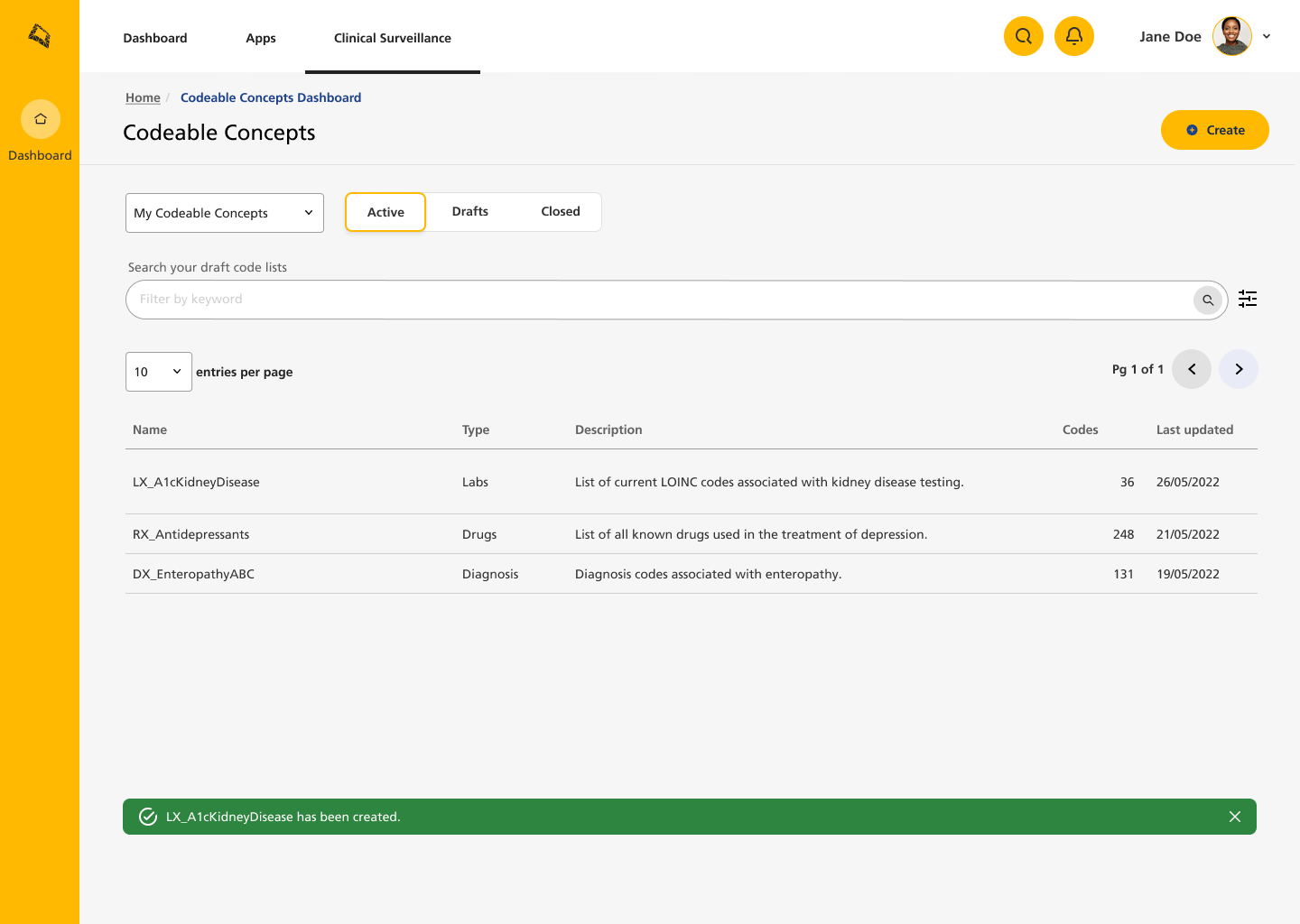
Active section of 'My Codeable Concepts.' Here the user can view their active concepts.
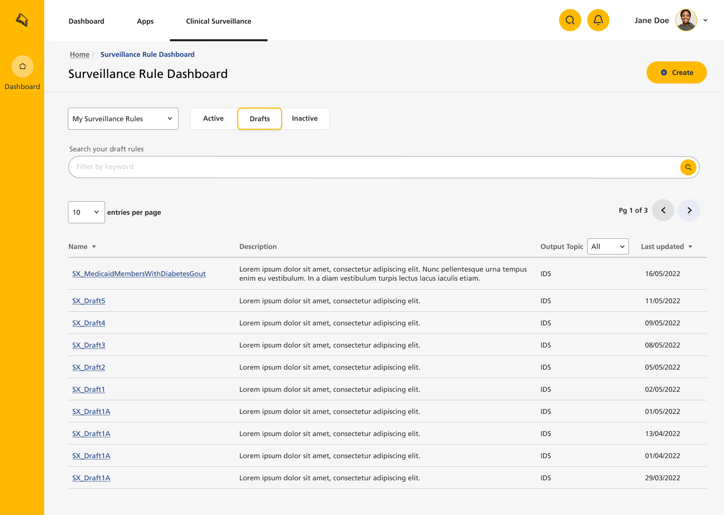
Drafts section of 'My Rules,' where user can edit rules until they are ready to be published.
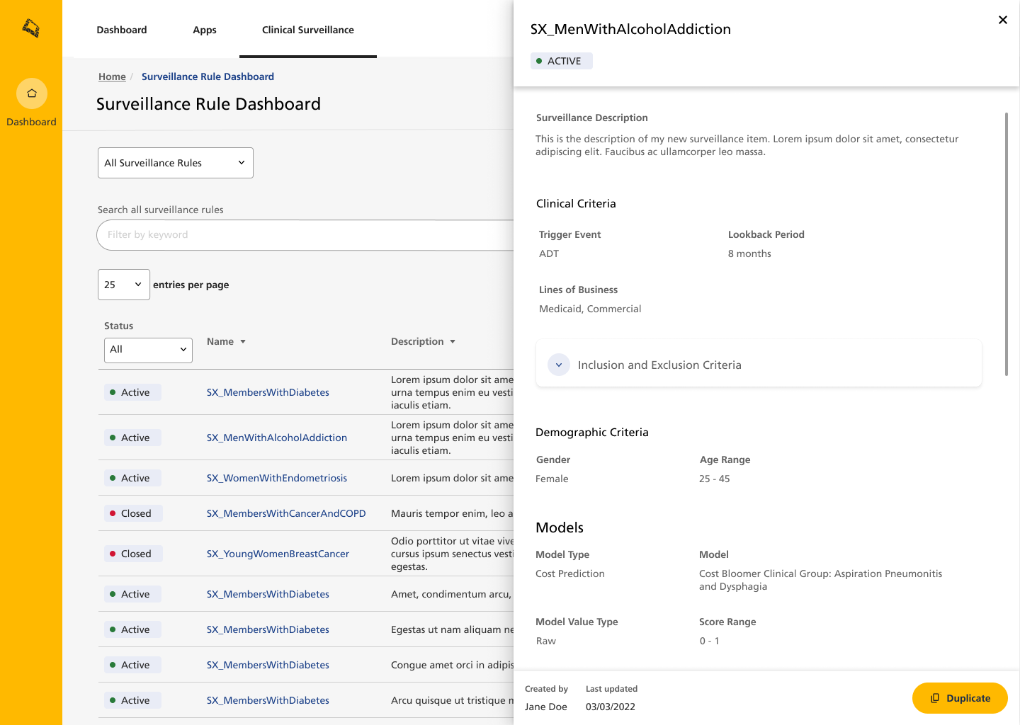
Rules library where users can search through existing rules created by them and other people. These can be duplicated to the user's drafts folder.
Concept Builder
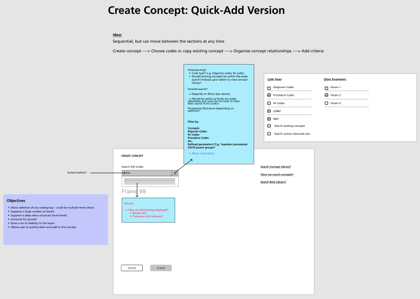
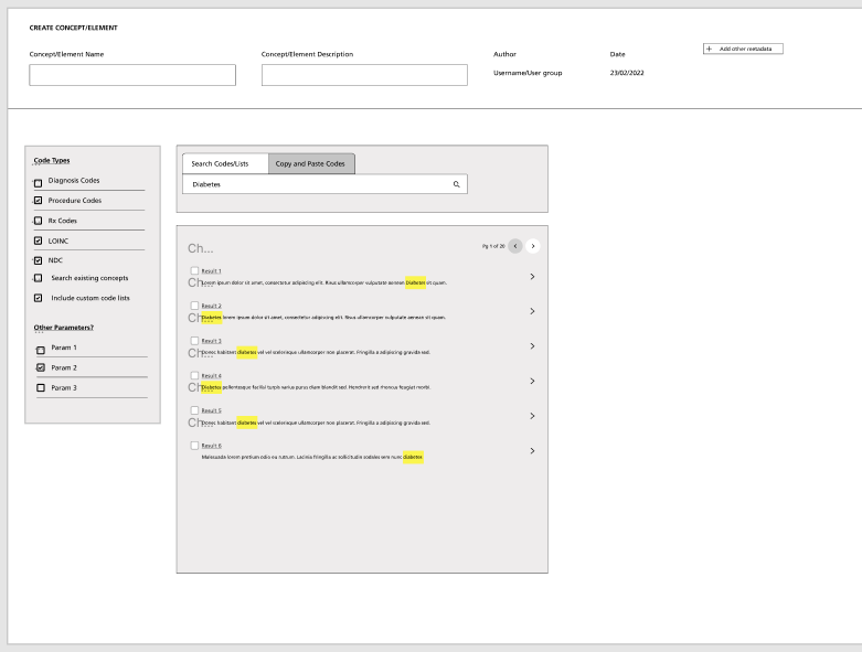
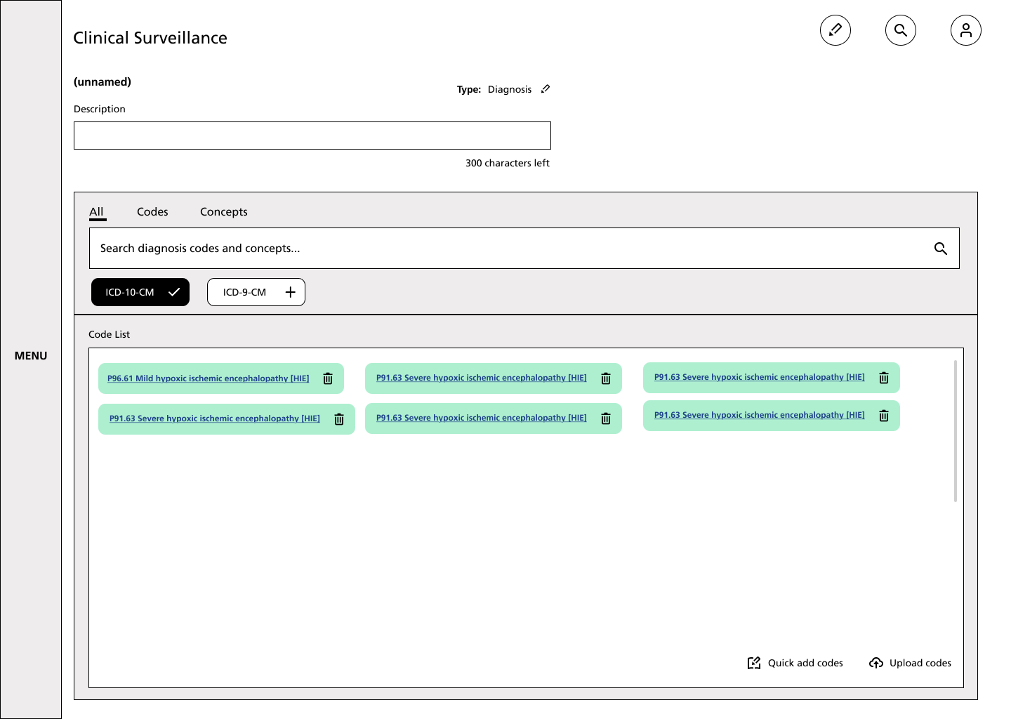
Without going into too much detail here, the concept builders went through multiple iterations before arriving at the final version.
Below, you can see some of the earlier lo-fi prototypes that were used to test the logic with users, and some of the later hi-fi mockups that were used for interactive testing.


User Testing and Feedback
Initial testing was done using interactive mockups in working sessions with users. Since we were working with a limited number of users, we did these in informal working sessions.
I left the project around the time that the MVP was being released to beta users, but the plan was to gather usability analytics from the platform to use in the development of CS version 2.
UX Writing - Improving the Experience
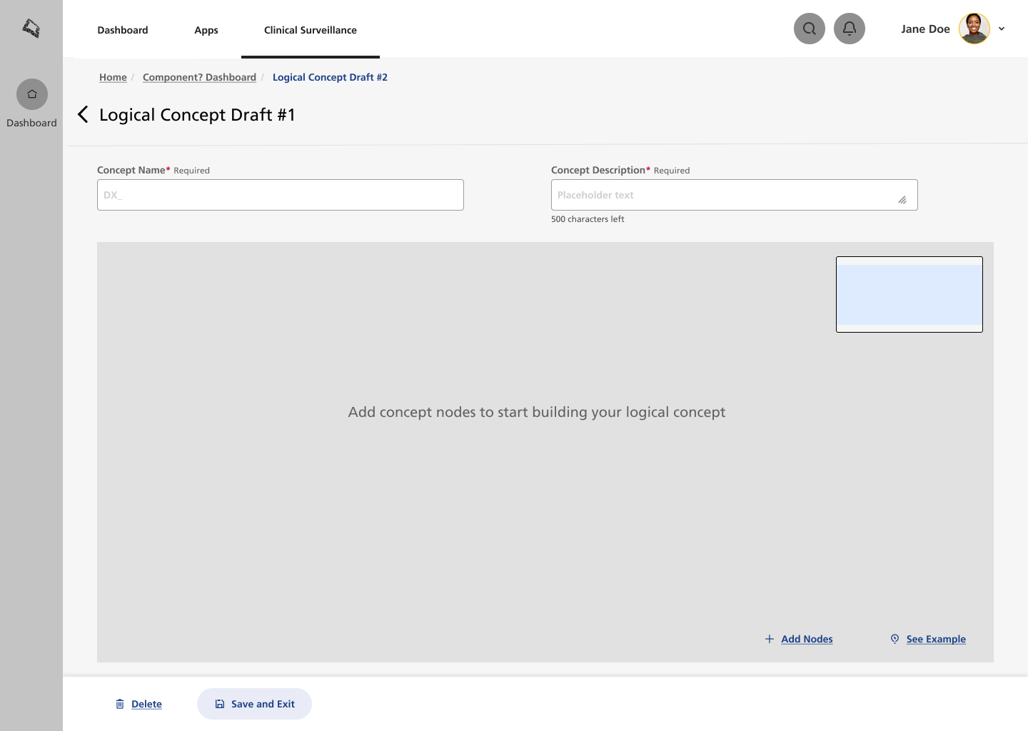
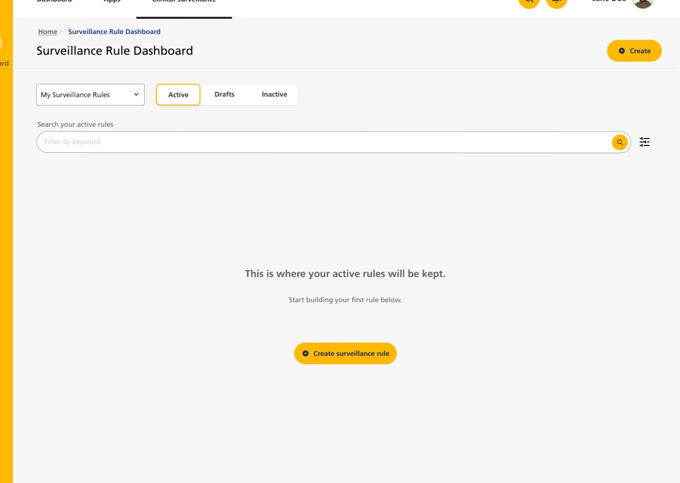
Due to the complex nature of the features in CS, I felt that both the UX copy and empty states needed additional attention.
I created a Voice and Tone style guide, working with the product’s original creators to combine their vision with my user research. I then implemented the following:
Empty states and progressive disclosure
Informative copy and guidance for difficult concepts
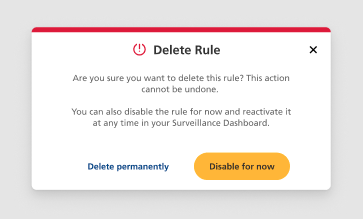
Error handling
I also started mapping out a prototype for a documentation section, and a ‘Getting Started’ guide for new users. The information gathered from testing the MVP could go on to develop these sections further.
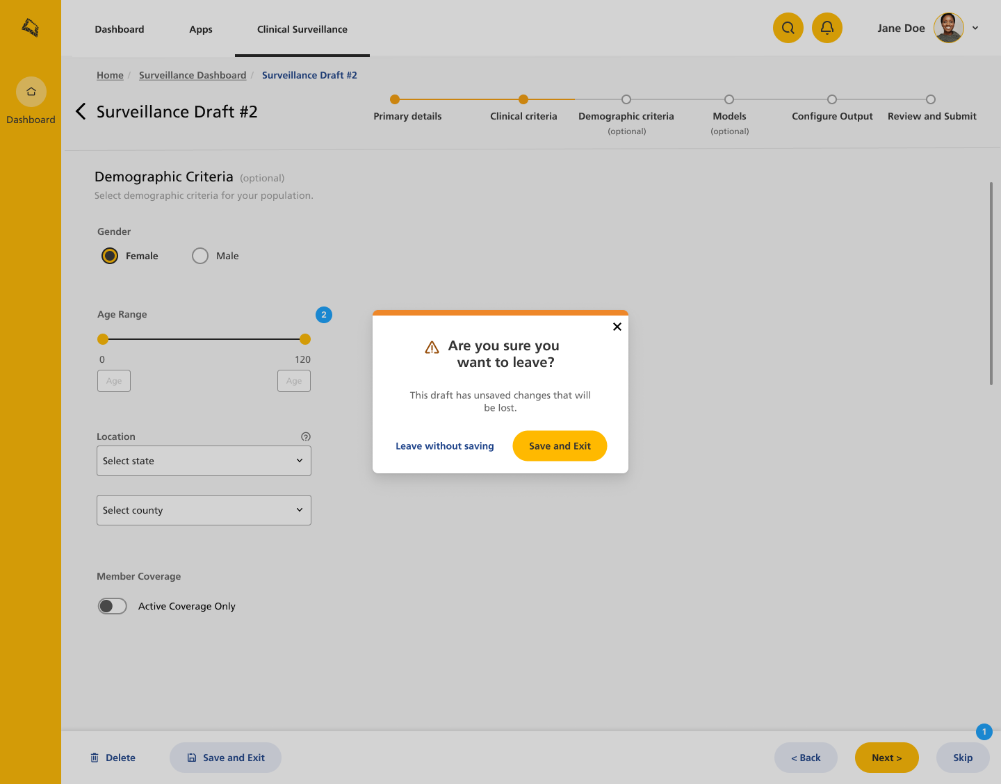
Information msgs help to reduce human error

Getting Started and Documentation sections accessible from homepage
Challenges and Lessons Learned
As the product had multiple user types, all of whom have varying degrees of knowledge when it comes to clinical codes and technology, the main challenge was in creating an intuitive interface for several complex actions. I learned a lot about the different approaches to this logic by reaching out to not only the clinical coders, but also some clinicians who were very familiar with the logic but not how to write any code.
The fact that there were a few similar products on the market, such as Stanford’s ‘Cohort Discovery Tool’, but none that encompassed all the functionality that our teams required, meant that I was creating something potentially very new, which was an exciting challenge for me.

