Clinical Data Reporting
2023 - 2024
Project Overview and Background
Over the years, numerous dashboards and digital reports containing clinical reporting data have been built in isolation for a variety of business users. Many of these reports contain similar, but slightly different, combinations of data to account for these different users, meaning that there is a lot of duplication and slight variation between reports.
I was onboarded to the project to combine these reports into a single reporting product. As part of this effort, I designed new dashboards and reports, while also uplifting and modernising older ones.
My Role
During my first 10 months on the project, I was the entire design team.
This meant that I undertook each stage of the design process myself; from conducting user research, designing wireframes and prototypes, to creating a new design system. I also often worked with the POs to flesh out their requirements and form relationships with stakeholders.
Towards the end of my first year on the project, a designer-in-training joined my team. Part of my role since has been in mentoring her, delegating work and ensuring that we work as a cohesive team with one vision.
I have also continued to be an outspoken advocate for the field of UXD within the department, particularly in pushing for more time to be spent on discovery and a problem-first approach, rather than a solution-first approach.
My Process
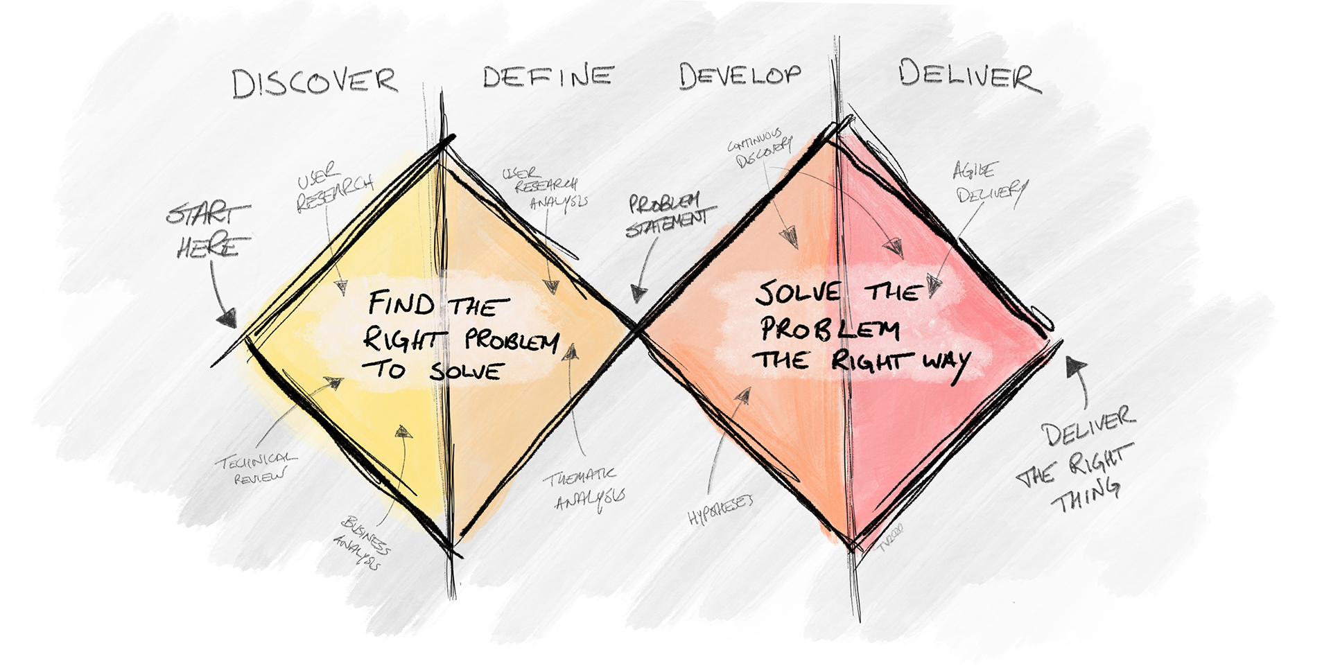
On this project, I implemented a mix of the Double Diamond process and Lean UX. Each report was like a mini-product, often with different users and stakeholders. Within these, some features were new while others were existing and required a redesign or enhancement.
As requirements came to me through multiple methods, it was important for me to remain flexible, but also push for a design thinking process to be followed as much as possible. I used a mix of generative and evaluative research to determine not only that we were using the right solution, but that we had even found the right problems to begin with - a question which often goes overlooked in rapid product development.
I always started with user research, even if I only had a very short timeline.
Who is the user?
What are their goals?
What problems have led to this design/redesign?
Knowing the answer to these is key, not only to designing a good product, but to ensure that all stakeholders have a source of truth and strong understanding of what we are trying to achieve.
A Quick Note on Healthcare Data
A few terms will be used here that may be confusing outside of a healthcare context.
Facility = any place where a patient receives treatment. May refer to hospitals, clinics, rehab centres, etc.
Submitters = organisations that submit patient healthcare data to the health insurer. They do this on behalf of the facility, who may not have the infrastructure to do so themselves.
ADTs, CCDs, ORUs = different health file types that are created and submitted to the health insurer
Research and Analysis
Gathering information
Research is always an intriguing process, in equal parts challenging and rewarding. The research for this project was no different. Some requirements came to me from users that I did not have direct access to via the product team, requiring me to reach out to multiple sources in order to get a clear picture of the ask and the background that informed it.
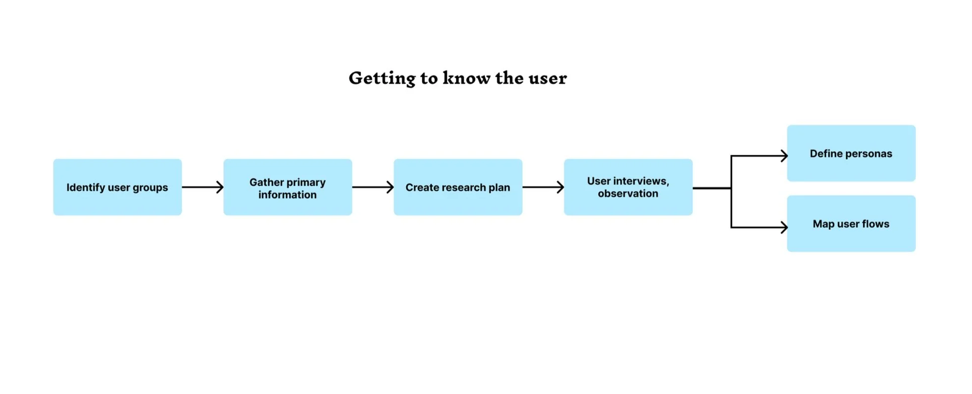
When I could gain direct access to users, I used generative and attitudinal methods to gather information. Focus groups were particularly useful when working on reports and features that had multiple user groups using the same data for different purposes, while user interviews gave us in-depth perspectives on everyday frustrations and opportunities for growth and enhancements. I also used remote observation to watch users interact with existing reports.
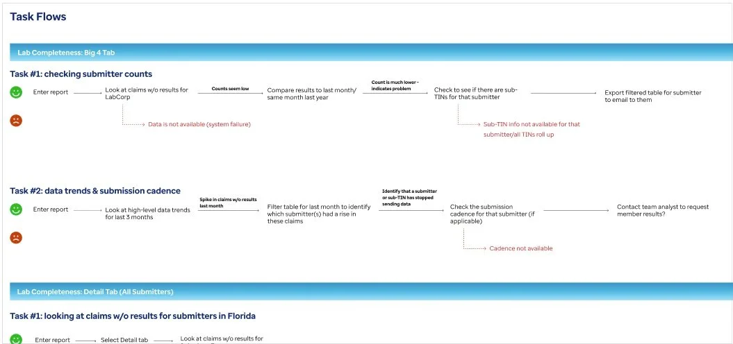
Using the information gathered in these interviews, I mapped out user flows and information flows.
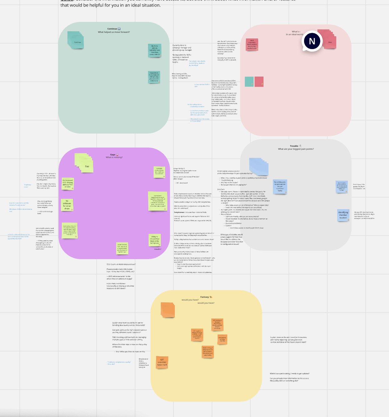
Needfinding session with users

Mapping the user flow of claims reconciliation
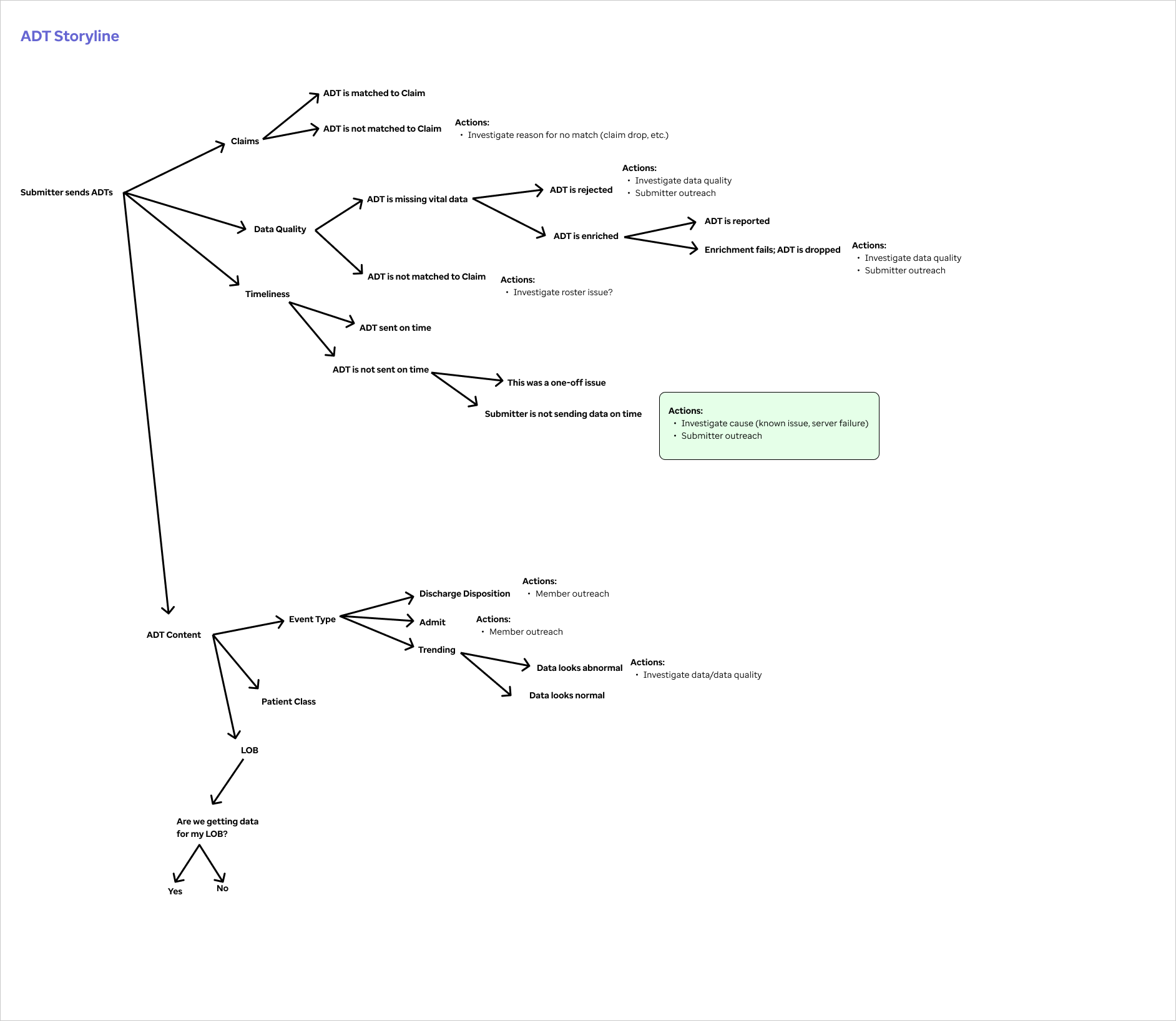
Mapping the flow of ADT messages
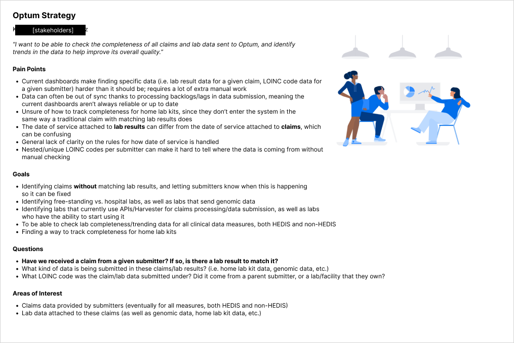
Examples of some user groups

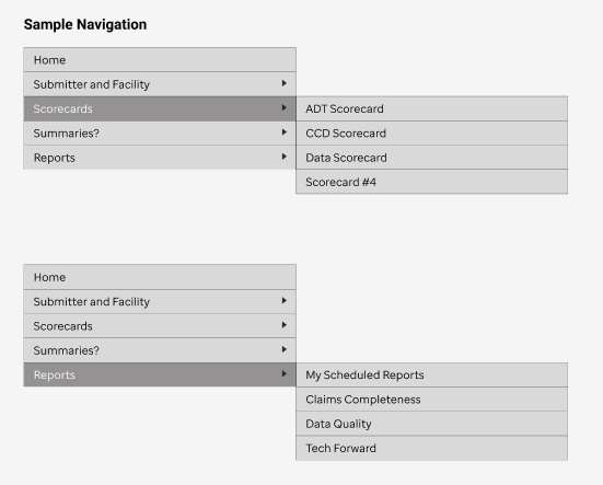
Site Map and Information Architecture
After discussion between myself and the product stakeholders, the vision of our reporting product was to create a layered information system. The top-level reports had the highest level details, intended for executive users. As the user follows the information trail, they can move down to progressively more detailed reports.
I added navigation and breadcrumbs to this, as users would likely want to go directly to their reports rather than start at the executive reports every time.
Products and features
As this project covers a multitude of mini-products, I’ve included a sample of them here.
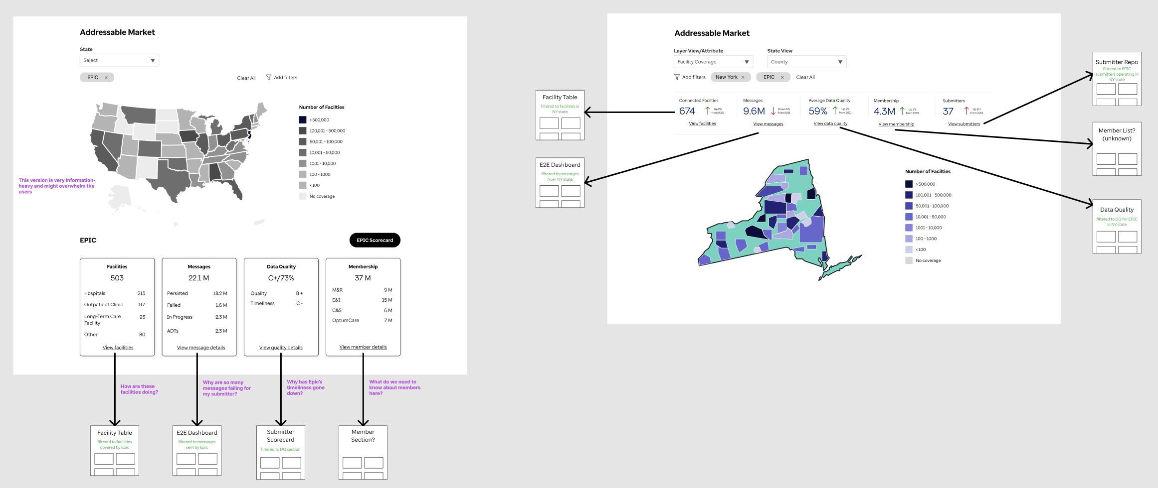
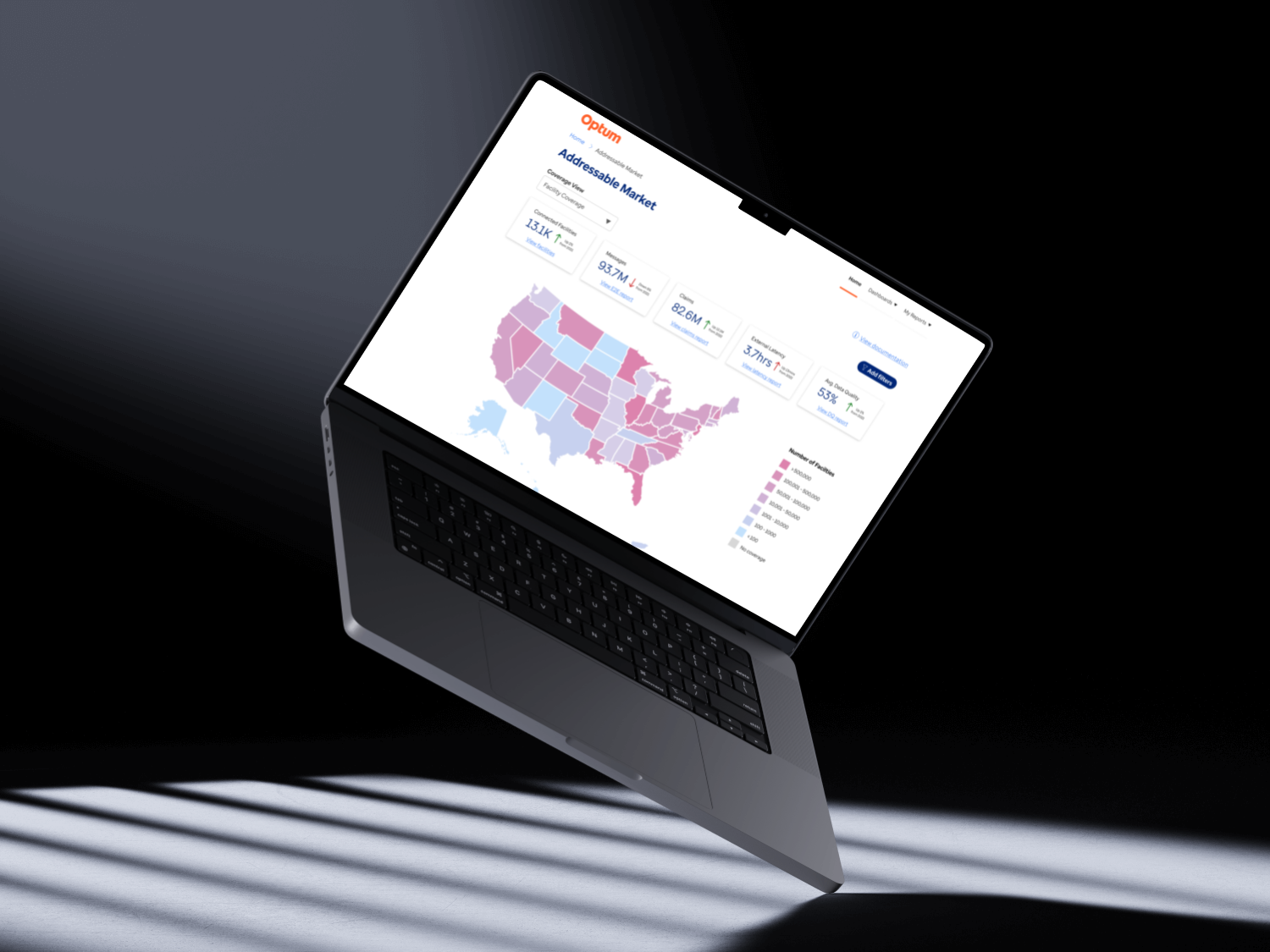
Feature #1: Addressable Market
Problem to be solved
The company gathers clinical data from across the USA. Some states performed better than others, or were underrepresented.
Users needed a way to tell how different data points (ADTs, facilities, data quality, etc.) were dispersed across the USA, with the goal of discovering in what locations there would be opportunities for outreach and improvement. This was currently done through examination of specific data tables, but there was no user-friendly representation.
Design iterations
Initially, the request from the users was to show facility locations across the USA. The most visually impactful way of telling this story was through the use of an interactive map that used a form of heat-mapping to indicate strong vs weak performers. This component was of benefit to two user groups: executive users could get an visual of the country overall, while CMOs or market users could drill down into a particular region that they were in charge of.
With each iteration of the design, I reviewed the structure and content with users to ensure we were moving in the right direction. As the process went on, it became apparent that a geographical distribution report would be useful for a multitude of data points, including distribution of insured members, difference in data quality per region and state. This led to me reusing the map feature for different ‘layers’ of data, which the user could change via a dropdown.
As we neared the final design, it was clear that users were excited by the information they were seeing and immediately wanted to drill down to more detailed reports related to these data points. Based on this feedback, I designed a header section where the user can view high-level information relevant to the coverage view, and also click through to the related reports.
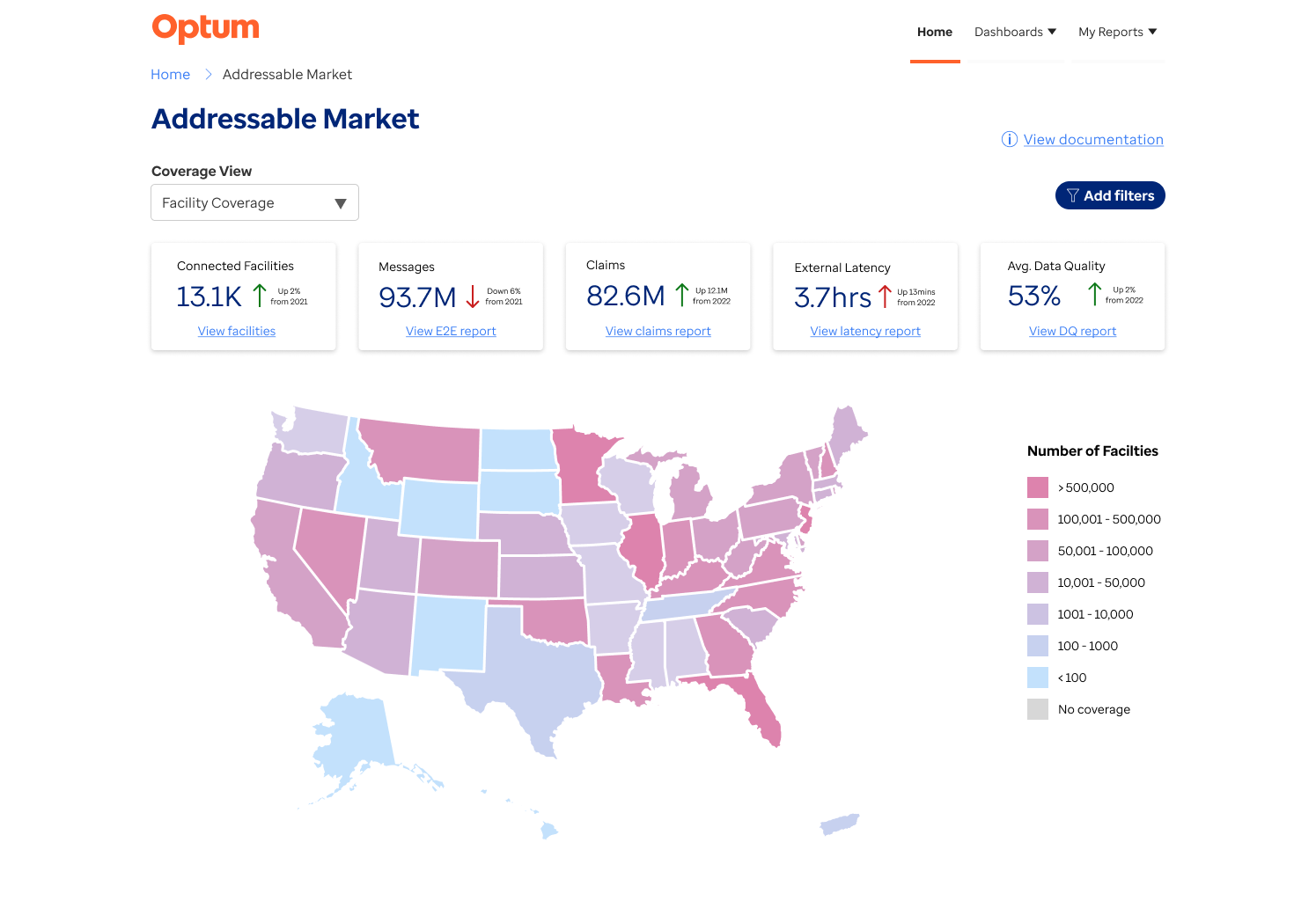
Facility Coverage view
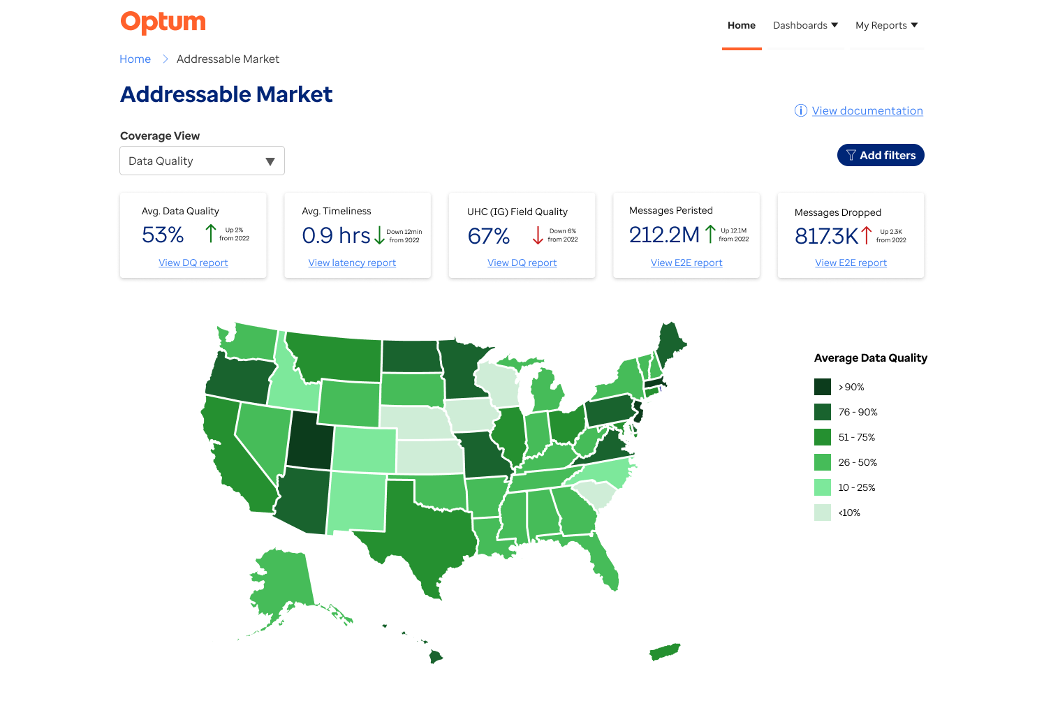
Data Quality view
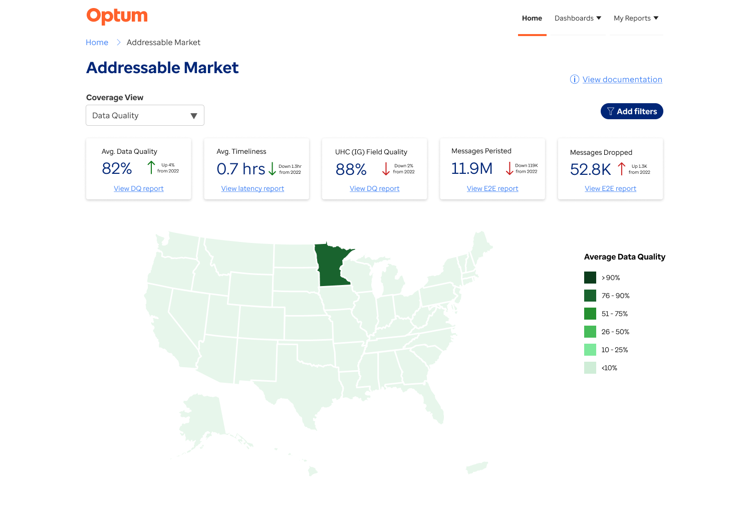
Data Quality view - state selected
Feature #2: Filter challenge
Problem to be solved
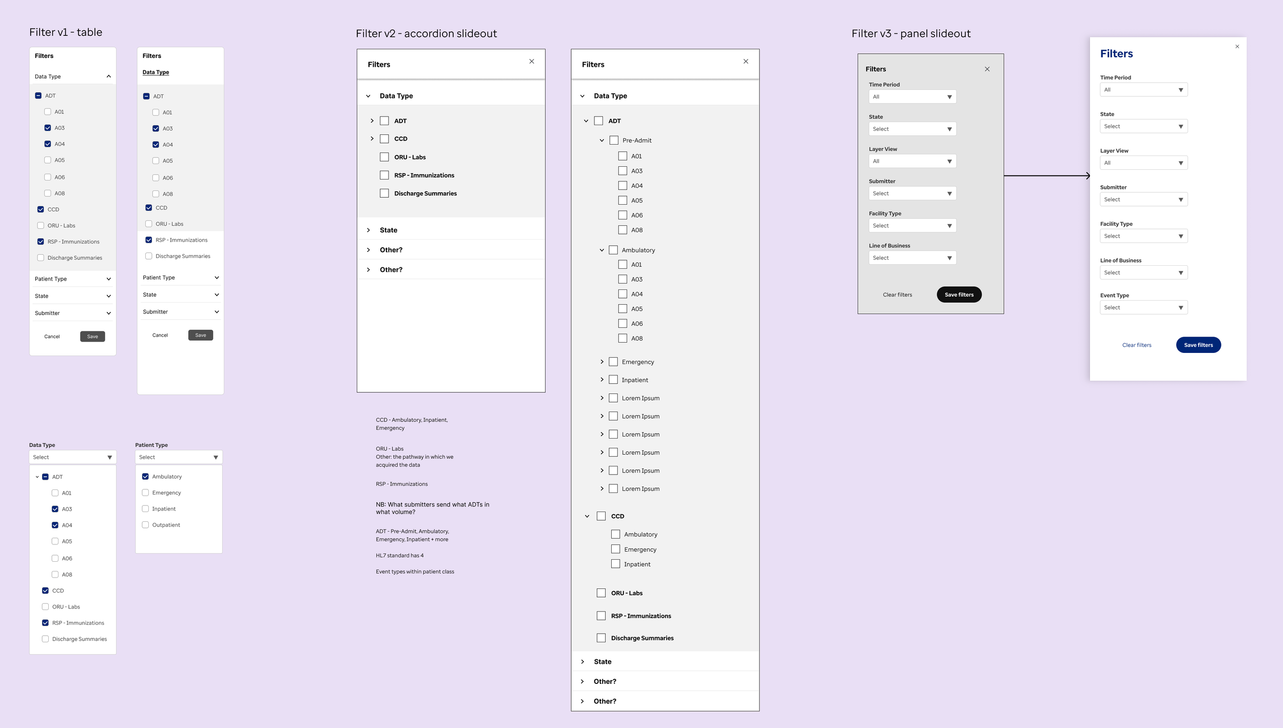
Given the large amounts of data that are captured in these reports and dashboards, it’s common that 8+ filter types are used on many reports. On the old dashboards, these were scattered all over the page as they had been added ad-hoc over the years. This led to a cluttered look, as well as the inclusion of filters that were no longer relevant.
Design iterations
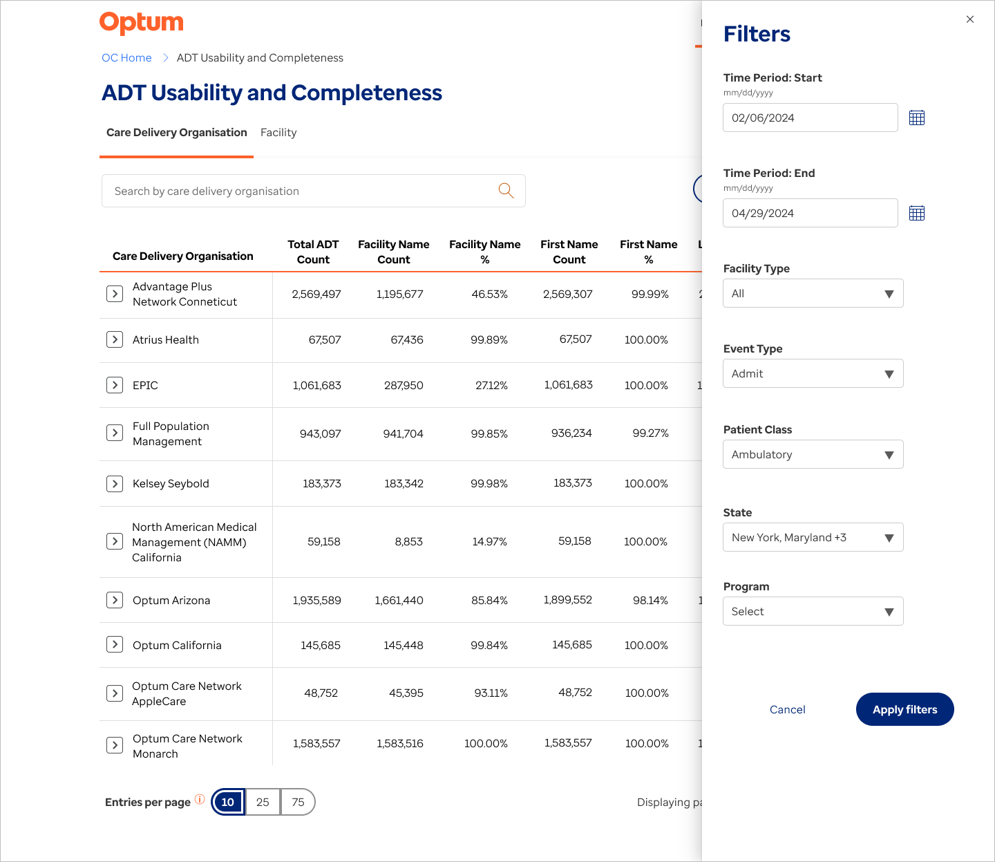
I created several designs, from table-level filters to sliding panels, considering the pros and cons of each. Given the number of filters, I made the choice to remove these into a panel, leaving only the search bar on the page. This design was tested out by users in 2-3 dashboards generated in Power BI.
Several user groups gave feedback that they wanted to view precisely what filters had been applied without opening the panel. This had been included in the original MVP design, but given the switch to Power BI, that design could not be implemented.
Working with the dev team, I edited the design to incorporate an active filter ___ where the users could see which filters had been applied, and easily clear these filters without reopening the panel. (add screenshots - filter panel open, filter tags)
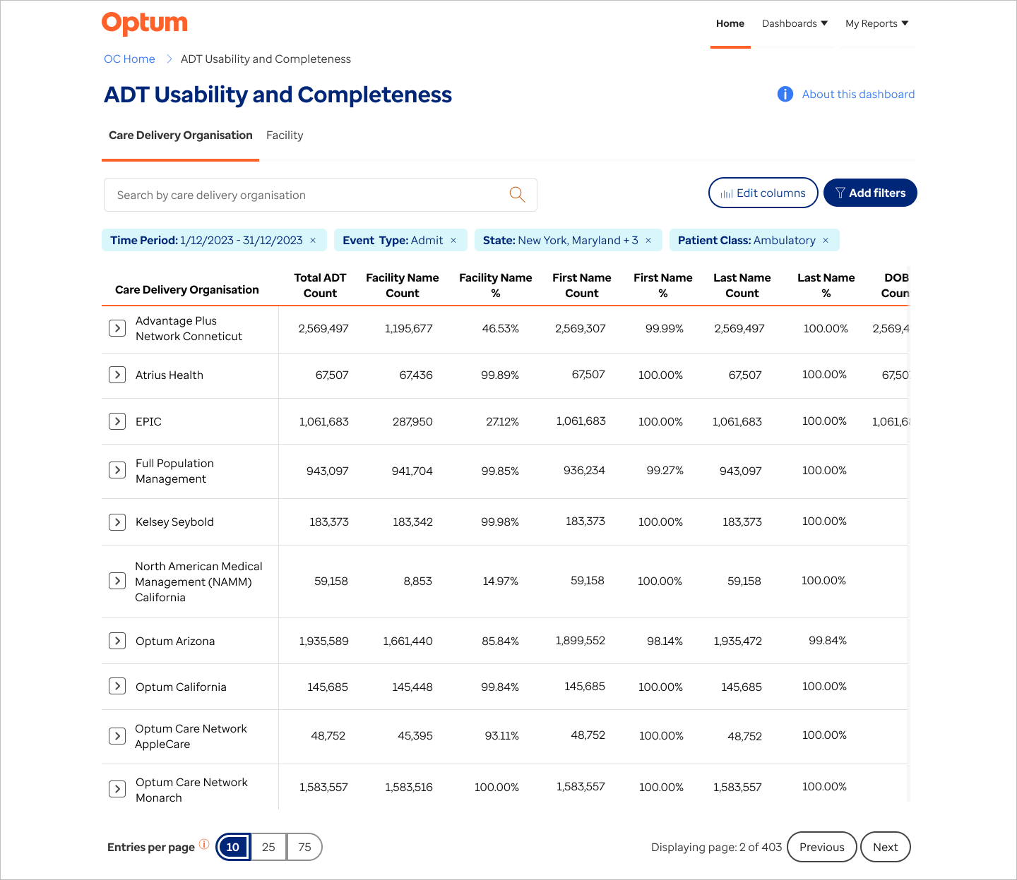
Feature #3: Modernising lab reports
Problem to be solved
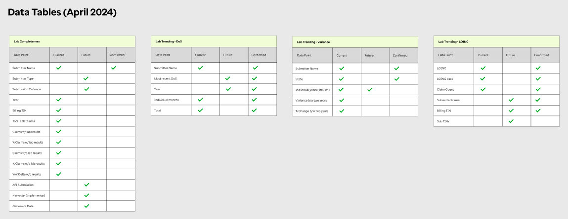
This feature was part of the effort to uplift and modernise existing dashboards. I set up meetings with two of the main users of the reports and we met weekly for about 2 months. The first few meetings were focused on information gathering, identification of pain points and opportunities for enhancement. The next stage was to to walk through lo-fi wireframes mapping out the flow and proposed changes. This is always an important stage, as often requirements are identified that were forgotten during the research phase.
I also performed a review of the existing UI, noting usability issues, such as:
Filters interfering with one another and not working as expected
Coding issues that led to the report not showing data that was selected
Lack of instruction or guidance for user
Design iterations
After confirming the user flows, I converted the designs from low-fidelity wireframes to hi-fi mockups
One was a walk-through with a larger user group. During this I explained individual problems that we were solving, showed the design and how I reached that solution. The group had the opportunity to give feedback or air any concerns they had.
Once we had the user sign-off, I created a design sheet for the dev team (see right), containing explanations of the design tokens and expected behaviour.
As of this writing, the feature is about to be released to users for beta testing.
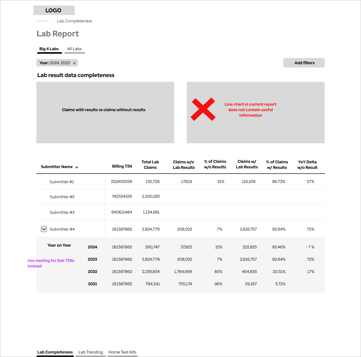
Mapping out the old report
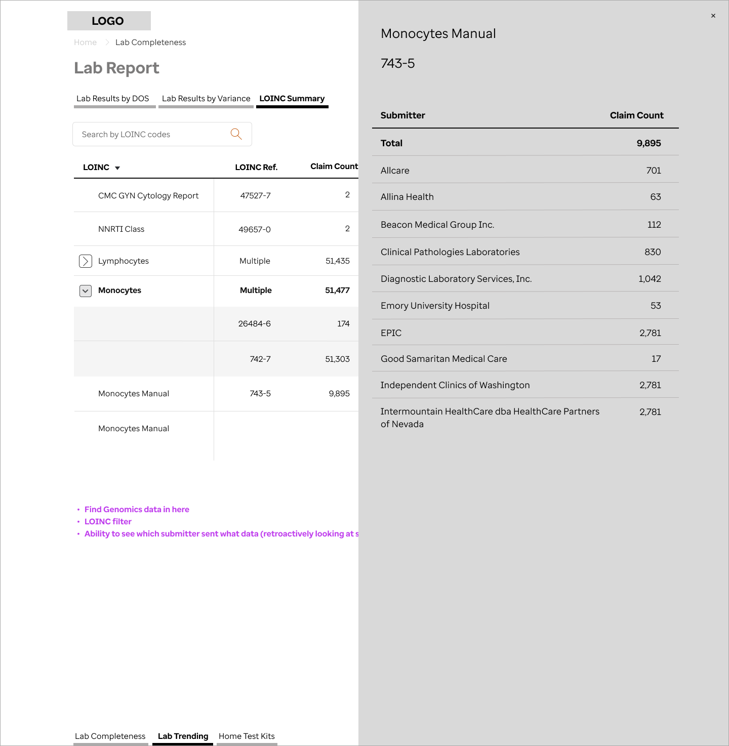
Testing methods of revealing additional lab information
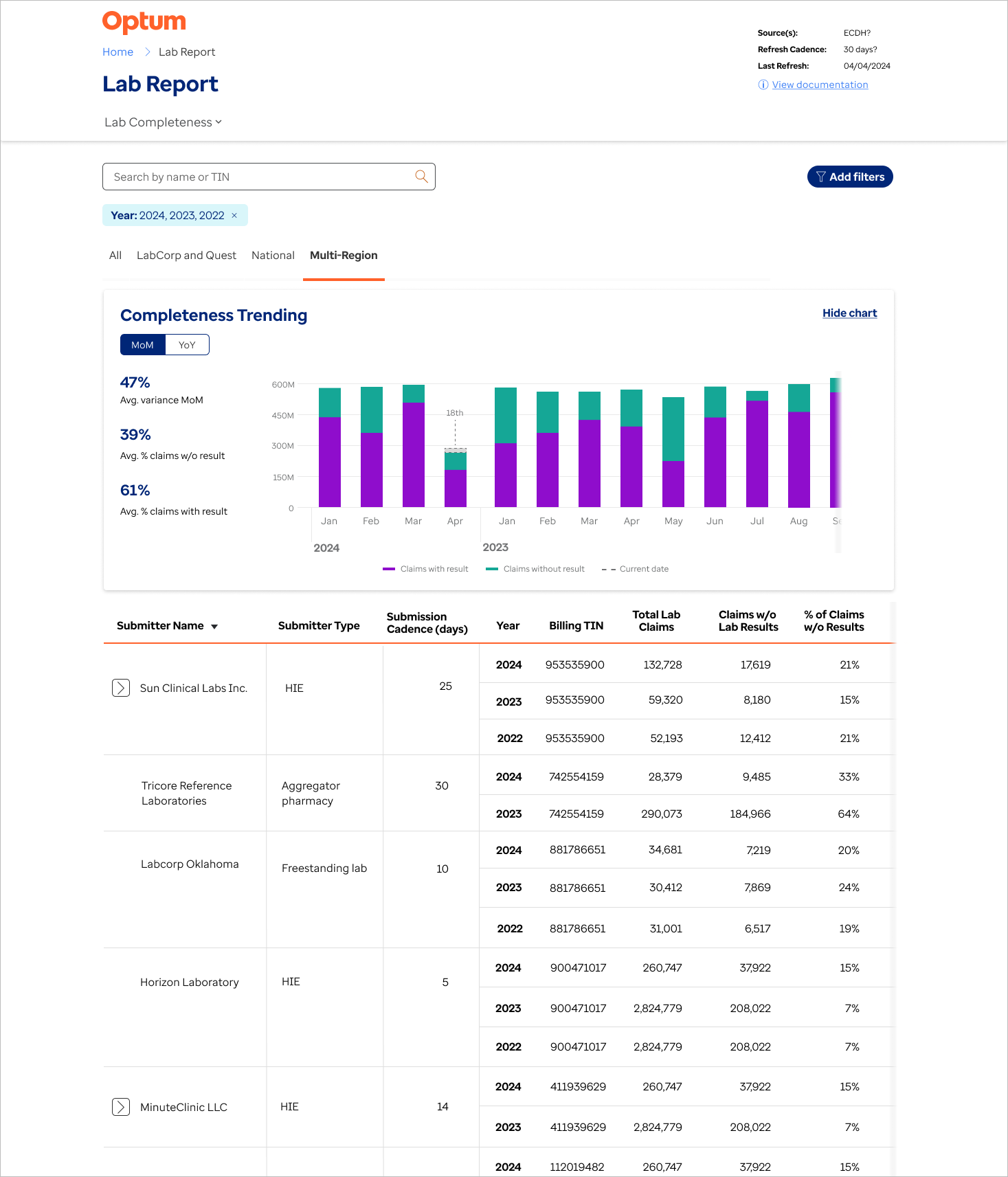
Completeness default page - final version

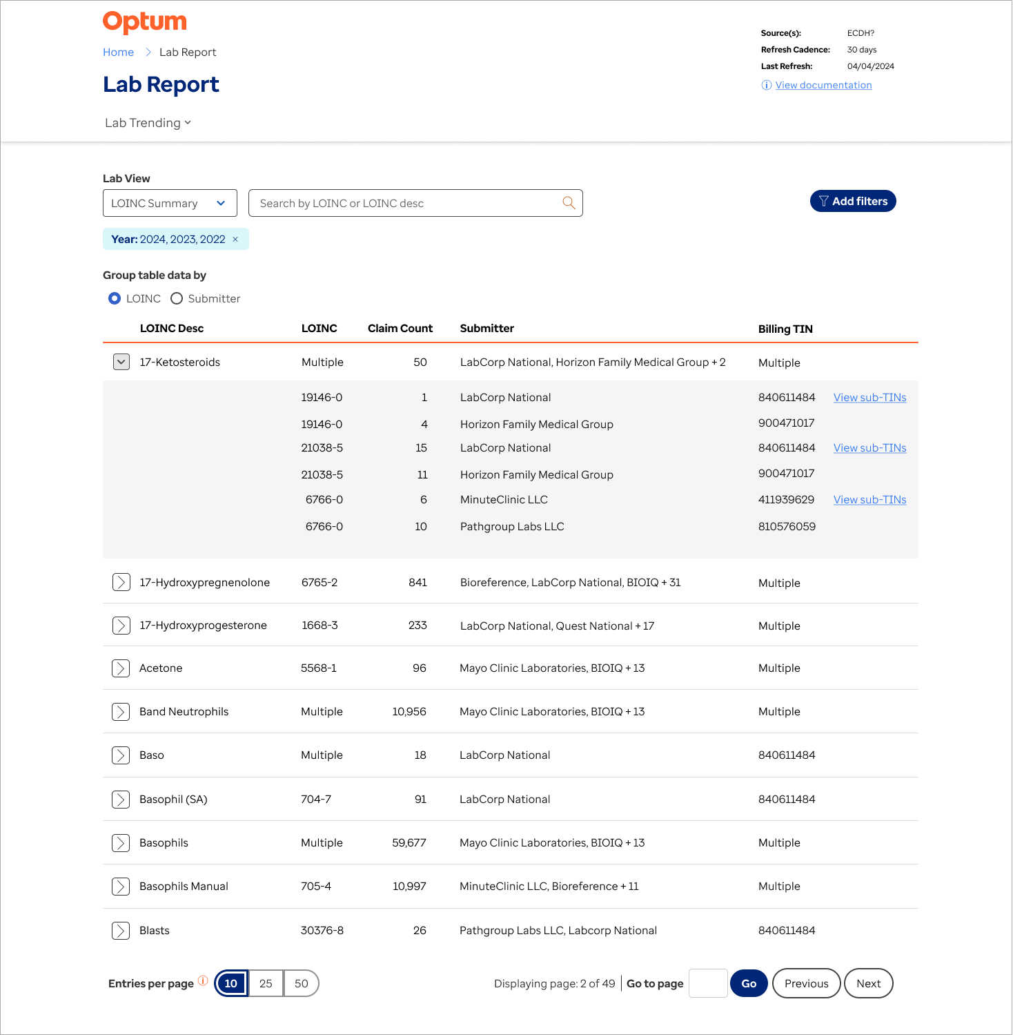
Trending default page
Feature #4: Modernising submitter scorecards
Problem to be solved
This feature was also part of the modernisation effort. Similar to the lab reports, the effort to modernise the scorecard had two goals: to add updated information not previously available, and improve the user experience through a redesign using good UX principles.
I met weekly with a team of the main users of the submitter scorecard. The first few meetings were focused on information gathering, identification of pain points and opportunities for enhancement.
Some notable issues were:
No analytical data relating to trends in the submitter’s data quality or cadence
No data related to facilities under that submitter - are they all sending data?
No connection to ticket submission
During the user sessions, other potential enhancements came to light. One was the ability for user to customise the scorecard view, which was not possible in the legacy version. Another was to include benchmarking, which I had been including in other reports - the ability to compare specific KPIs to the previous year.
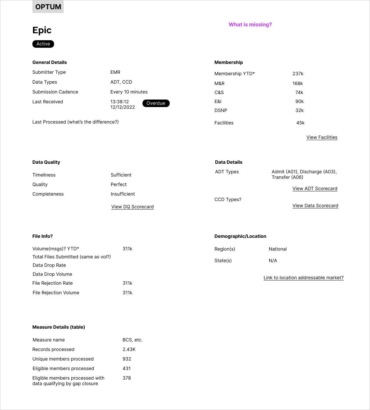
Mapping out information sheet
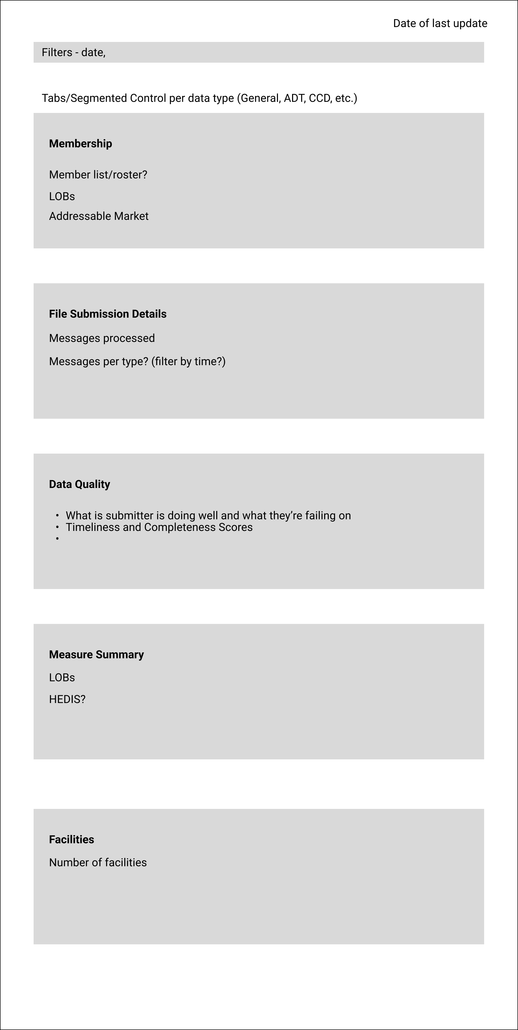
Organising data into sections

Mapping out information setup on platform

Final version - expanded CCD view

Edit layout and widget combination in side panel
Feature Quality
Given the velocity of the project, production of new features was often given priority over a focus on the quality of the user’s experience.
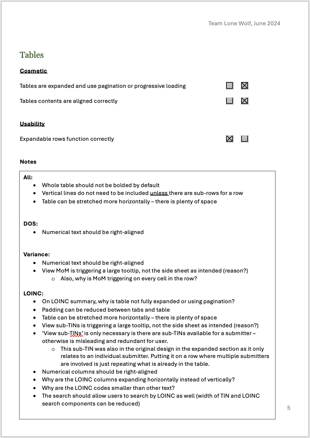
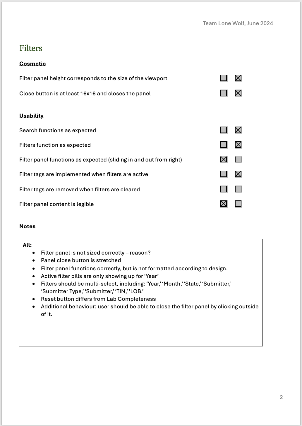
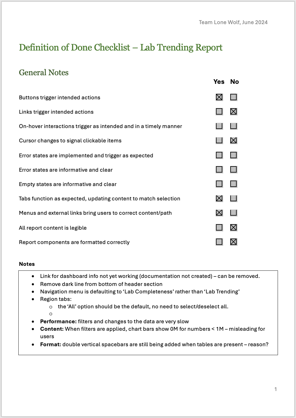
I created a Definition of Done (DoD) document specifically for UX. Similar to a heuristic evaluation, my team used this to review each front-end feature before it was released by the development team, catching cosmetic and usability issues. These would then be reworked and repeated. This was not only beneficial in creating a better product for the end user, but it also helped the entire team to think more about the experience of the user.
Challenges
This project has been my most challenging yet, for a variety of reasons:
Communication issues
Teams within the organisation were quite siloed and often requirements were communicated differently to different individuals and teams. This caused a lot of confusion and meant that the problems to be solved were often not properly understood. I often became the bridge between users and the scrum teams, speaking with them directly and clarifying use cases and goals.Taxing timelines
Both the design team and the scrum teams had a quick turnaround time on most features, meaning that requirements were often still being clarified mid-design or even mid-development.Changing priorities
While we had a yearly roadmap, priorities were sometimes changed or new items were pushed to the top of the backlog. While quick iterations are a valuable component of the Agile and Lean UX processes, this was often unsettling for the teams.Lack of understanding about UX
This is a bump in the road that I often come across; when product and scrums teams are unfamiliar with, or have an incorrect understanding of, UX design. While I had some strong allies in the product team, I also made a concerted effort to increase the visibility of UXD, volunteering for departmental presentations, running educational workshops, and creating additional documentation for scrum teams.
