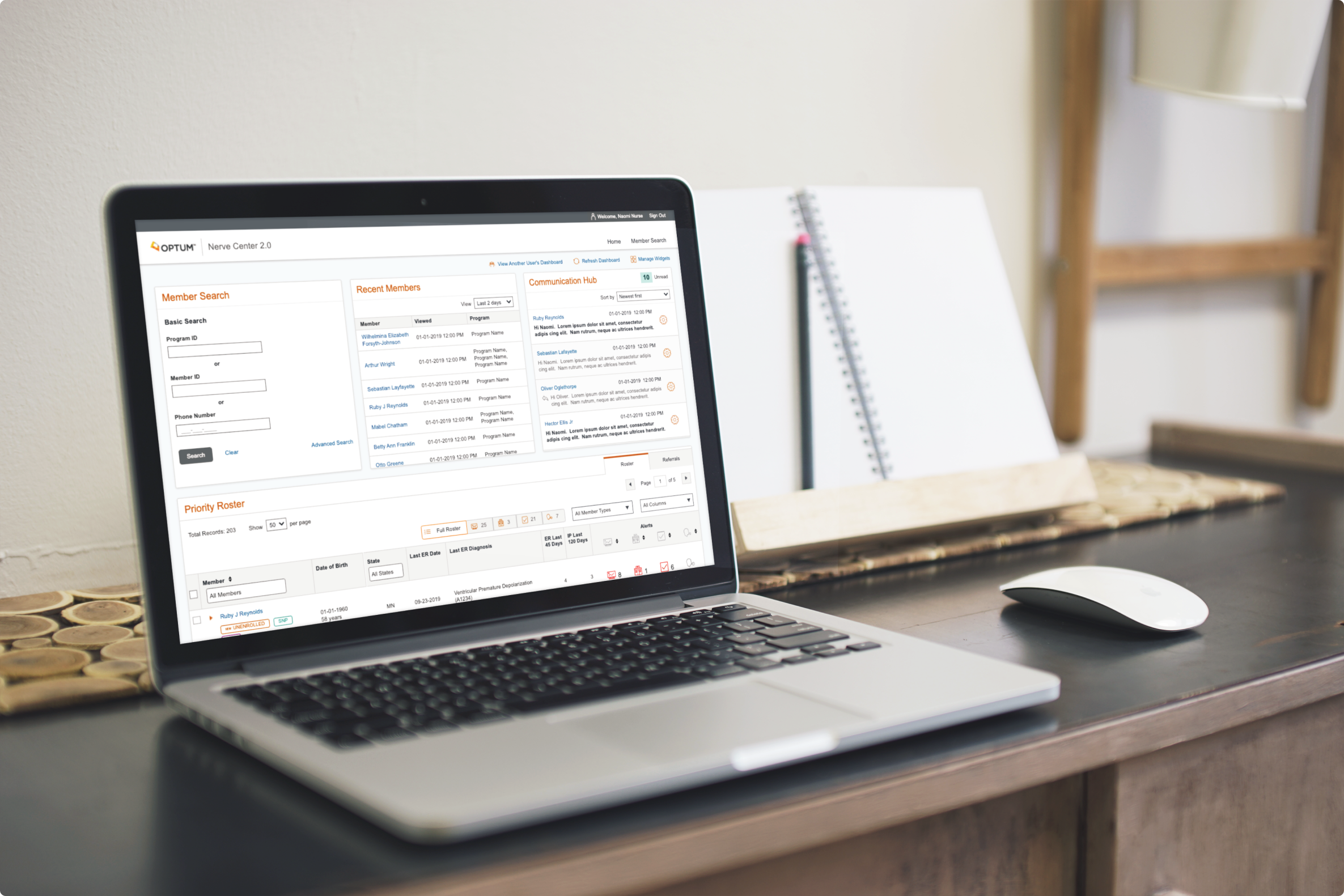
Nerve Center
2020 - 2021
Project Overview
NC2.0 is a configurable health platform for desktop, designed primarily for remote patient monitoring in the USA. The product spans the continuum of care and integrates multiple systems, including legacy software and smart technology, in order to optimise and simplify the clinical workflow for nurses and other healthcare staff.
The primary users are our internal nursing staff (RNs) who used the system to remotely monitor chronically ill patients. The system allows them to prioritise patient outreach based on biometric data, IP/ER visits, communication from patients and time-sensitive administrative tasks.
My Role
I joined the NC2.0 project in January 2020, and spent 15 months designing new product features and components for NC2.0, primarily for the Medicare & Retirement member cohort. I also designed MVPs for associated systems such as NC Lite, an external-facing version of NC2.0, as well as some proof of concepts that were being developed.
As the only designer on the project for almost a year, I filled the role of both UX and UI designer, working alongside multiple scrum teams, product owners and business owners. I also worked directly with cohorts of our users, making sure that their voices were heard throughout the process.
Research and Analysis
Our Users
When I joined the project, user requirements were being gathered by a single business liaison and often lacked necessary details or were miscommunicated to, or misunderstood by, the tech teams. As a result, certain features did not meet user needs and required rework.
I convinced the business stakeholders to allow me to conduct regular feedback and needfinding sessions with our beta users. These sessions were invaluable for ensuring that requirements were accurate, and that new designs were validated. They also allowed me to better understand the nurse’s daily work processes and goals. Throughout my time on NC2.0, I had weekly meetings with our primary users: registered nurses who were using our tool on a daily basis. The nursing staff collaborated closely with us in building the NC2.0 platform, and these meetings were an important space for them to discuss issues arising from new features, as well as suggesting enhancements. The sessions were also a great forum for me to do walkthroughs of new designs, and to develop strong working relationships with the users.
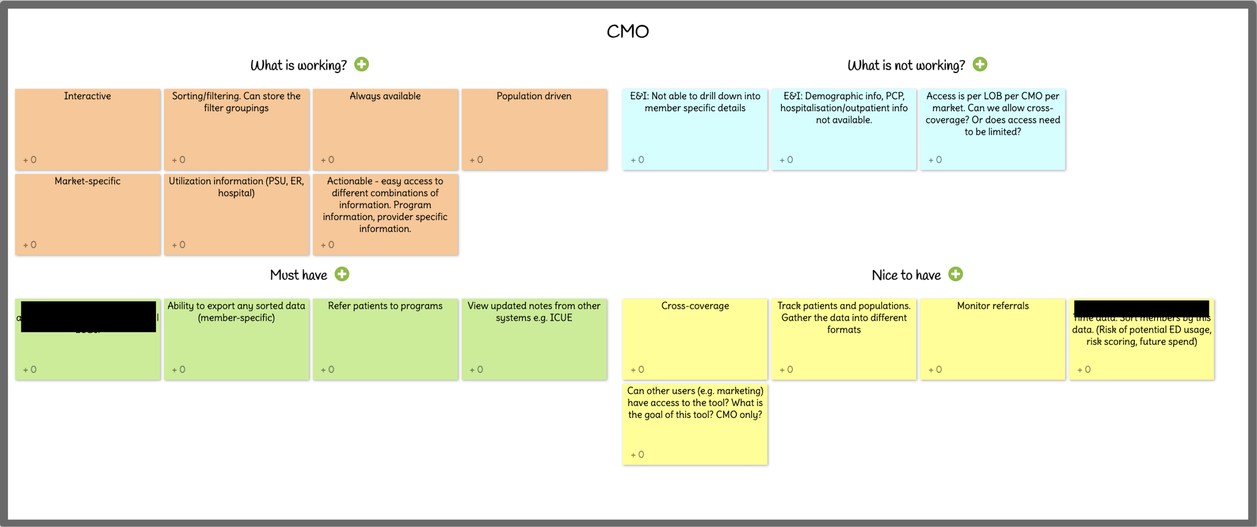
Later in the process, I also worked with a variety of Chief Medical Officers (CMOs) to create a personalised version of NC2.0 that would allow them to view member groups at a higher level.
Objectives and Pain Points
One ongoing issue for the users is how difficult it is to gather clear medical information over the phone. They reported that information gleaned this way is generally disjointed and piecemeal, with members jumping between topics. One nurse likened it to detective work, trying to pick out relevant information from what members say and don’t say.
Some other common themes and must-haves for NC2.0 became apparent in these early conversations, including:
Reduce number of clicks to improve workflow
Ability to quickly navigate between different parts of the UI
Ability to view all details of a member’s care journey in one centralised space
Reduce rework and unwanted outreach to members
Ideation and Design
The User Interface
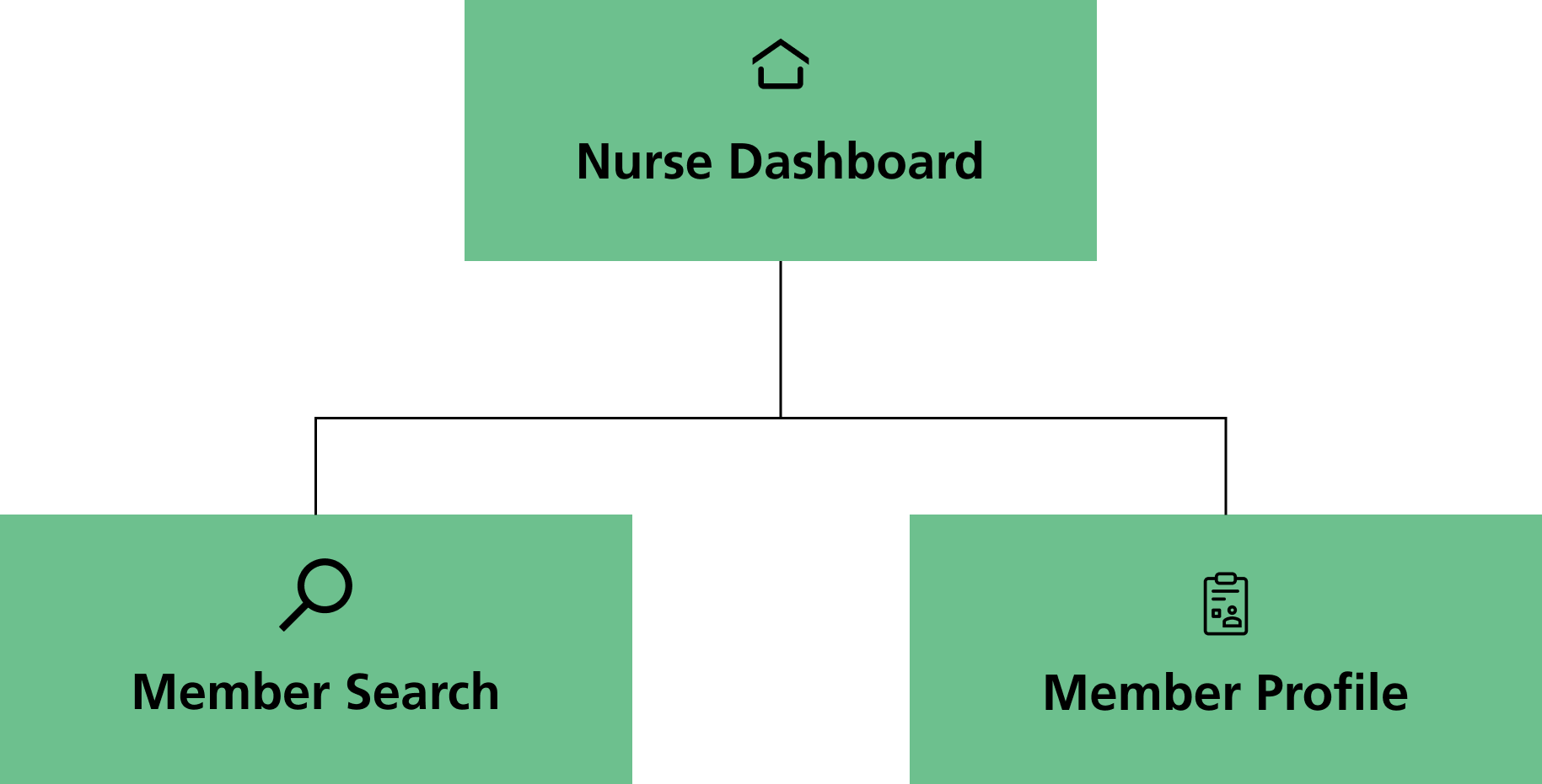
When I joined the project, the main UI had already been built and had three main pages:
Nurse Dashboard (homepage), where the nurse users could organise and prioritise their workload. The focus of this page was the Priority Roster, where members were sorted based on priority - e.g. biometric alerts.
Member Profile page - a unique health record for each member
Member Search page, where users could search for members by name or ID.
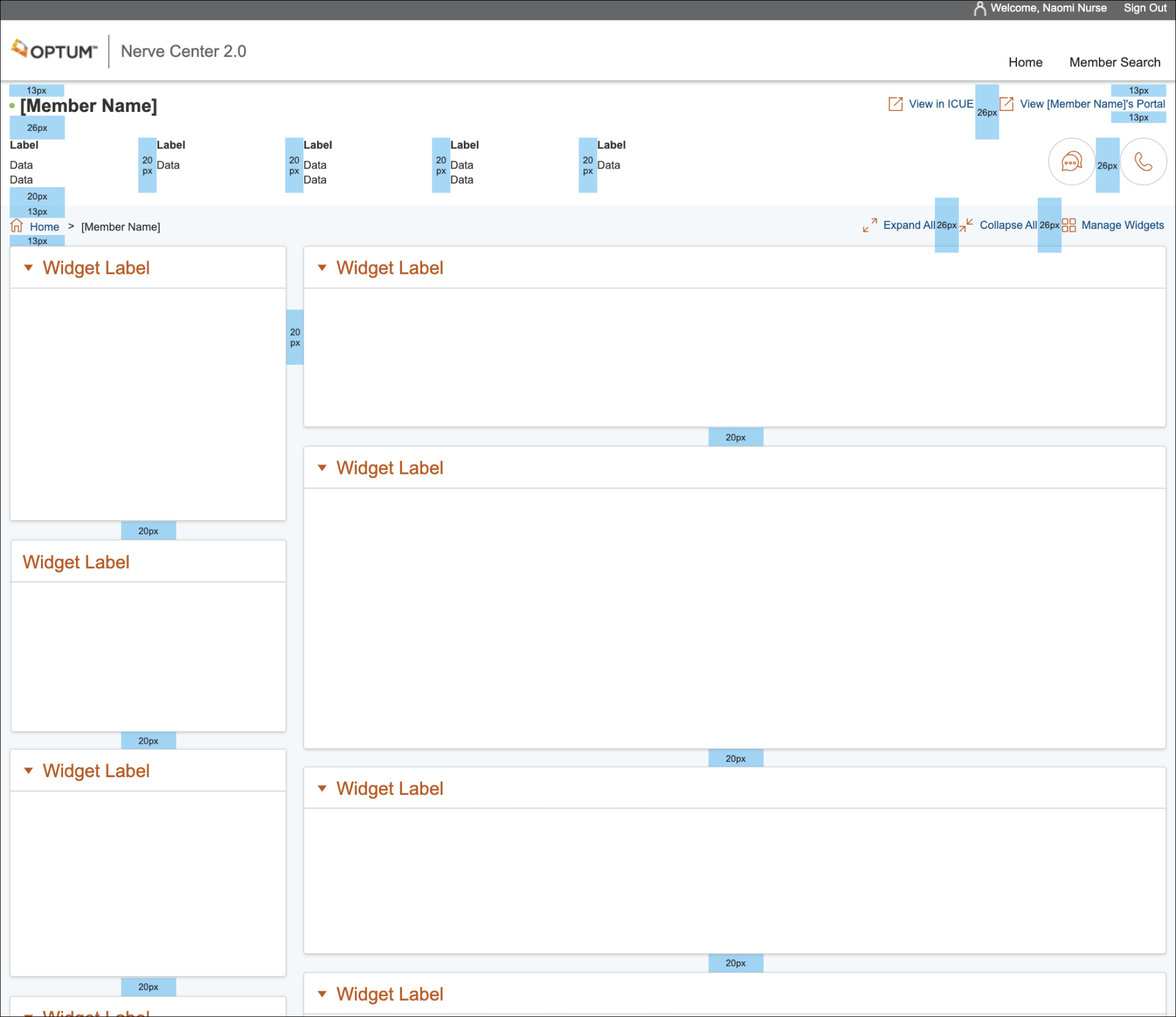
Each page was laid out using a widget-based system, with each widget being independent from the others. The layout of each page could be customised by the user, as well as adding or removing widgets.
The UI was designed using UITK4, one of our internal design kits.
Designing Features…
During my time on Nerve Center, I worked on dozens of features for the platform. This included designing new features, redesigning older features that required updates or were not functioning correctly, and collaborating on features with other internal data teams. I also designed prototypes for features that were suggested by the users and dev teams, in order to help pitch them to the business.
I created simple, low-fi wireframes to test with users and validate the designs. I then created hi-fi interactive mockups to pass on to the dev teams, showing expected functionality, different states, etc.
(grid system)
Below are some examples of features that I worked on.
Feature #1: Provider Search
Context
Up to this point, there was no method for clinical staff to run a search for medical providers.
Records for medical providers were not regularly updated, duplicate records were common and information for providers would generally have to be inputted manually into the patient’s online file, which was a drain on the nurses’ time.
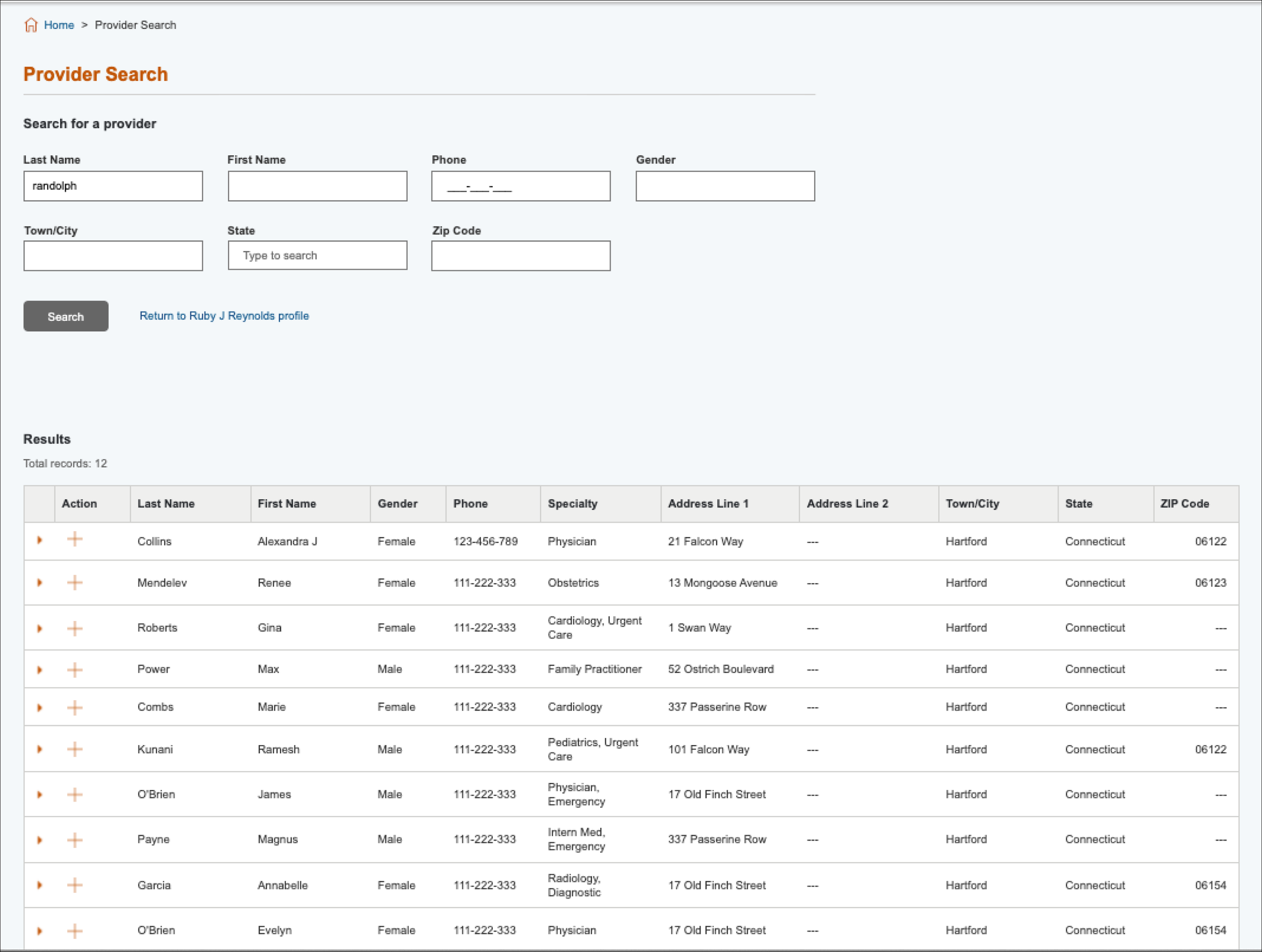
Often medical records are not updated to include the most recent Primary Care Physician (PCP) that a patient is visiting, or the database may not include up-to-date contact details for a provider. Because of this, the PCP may not be aware of recent medical issues or treatment plans that the member is enrolled in. The Provider Search feature allows the user to quickly search through the provider database and add them to the member’s record, as well as to submit a request to update that provider’s information.
Solution
Given that the Provider Search would be part of multiple user flows, I opted to create a separate page for it. It was essential that navigating to this would not be disruptive when the user was in the middle of updating other member information, or be so cumbersome that it would cause them to miss important information over the phone.
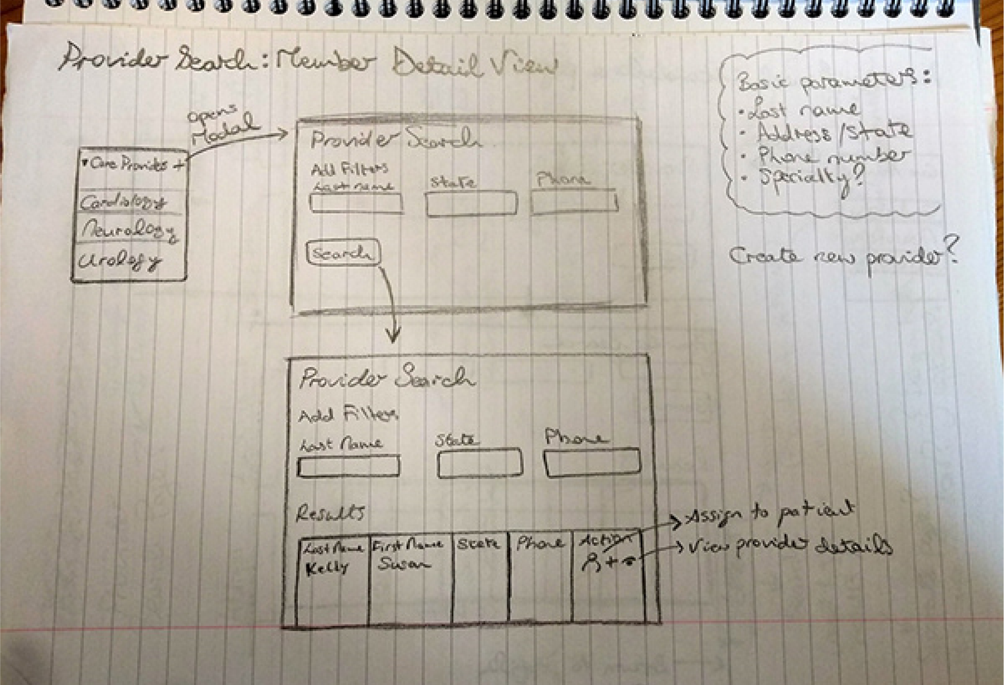
Initial concept sketches

Lo-fi wireframes for user walkthrough and feedback sessions

Feature #2: Task Manager
Context
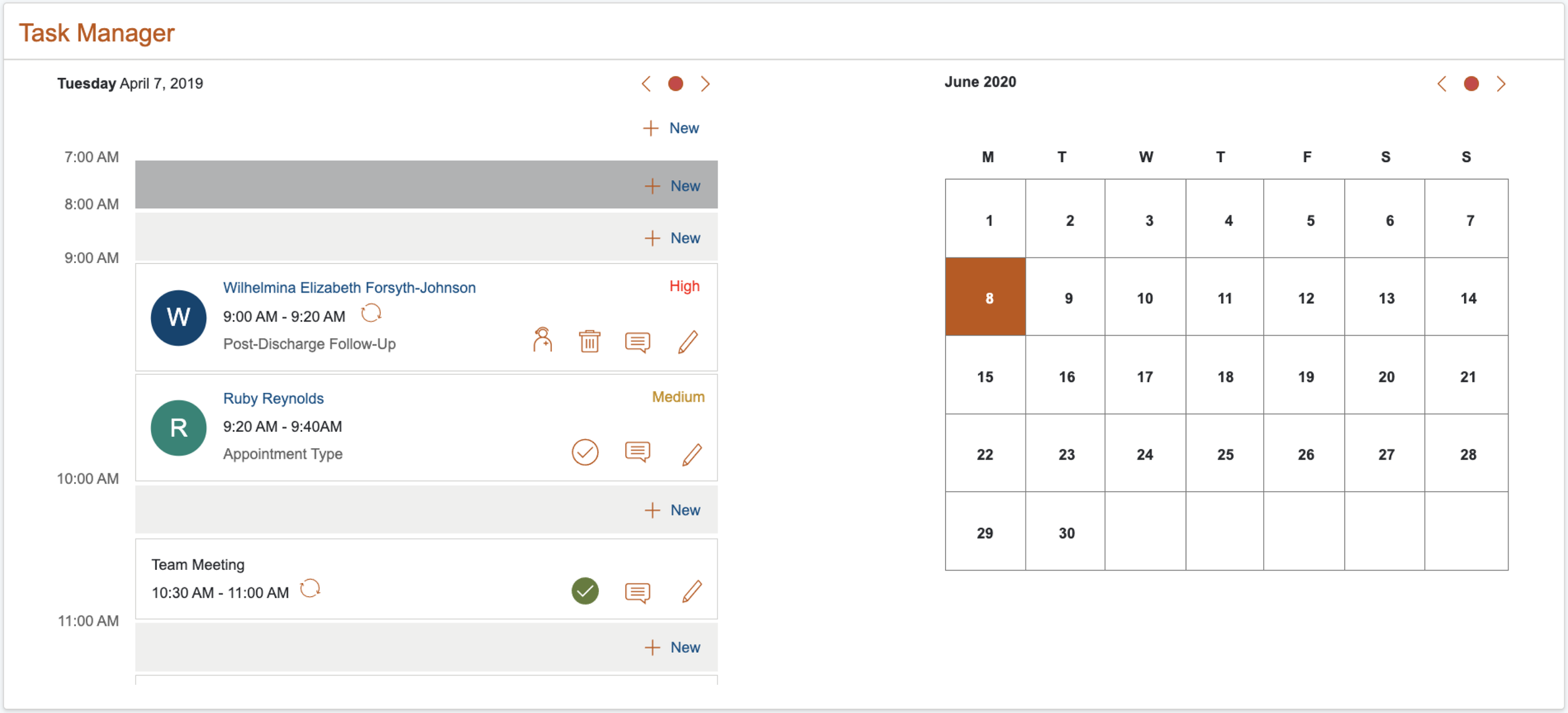
The Task Manager was a feature that I designed in collaboration with the users. As the aim of Nerve Center was to create a centralised system, switching back and forth to their calendar not only slowed down the users, but also meant that there would be no record kept on NC2.0 of the last time a member was contacted.
Solution
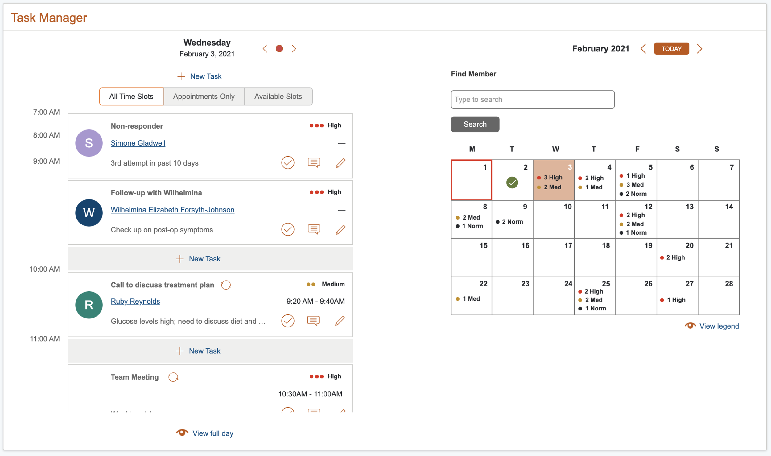
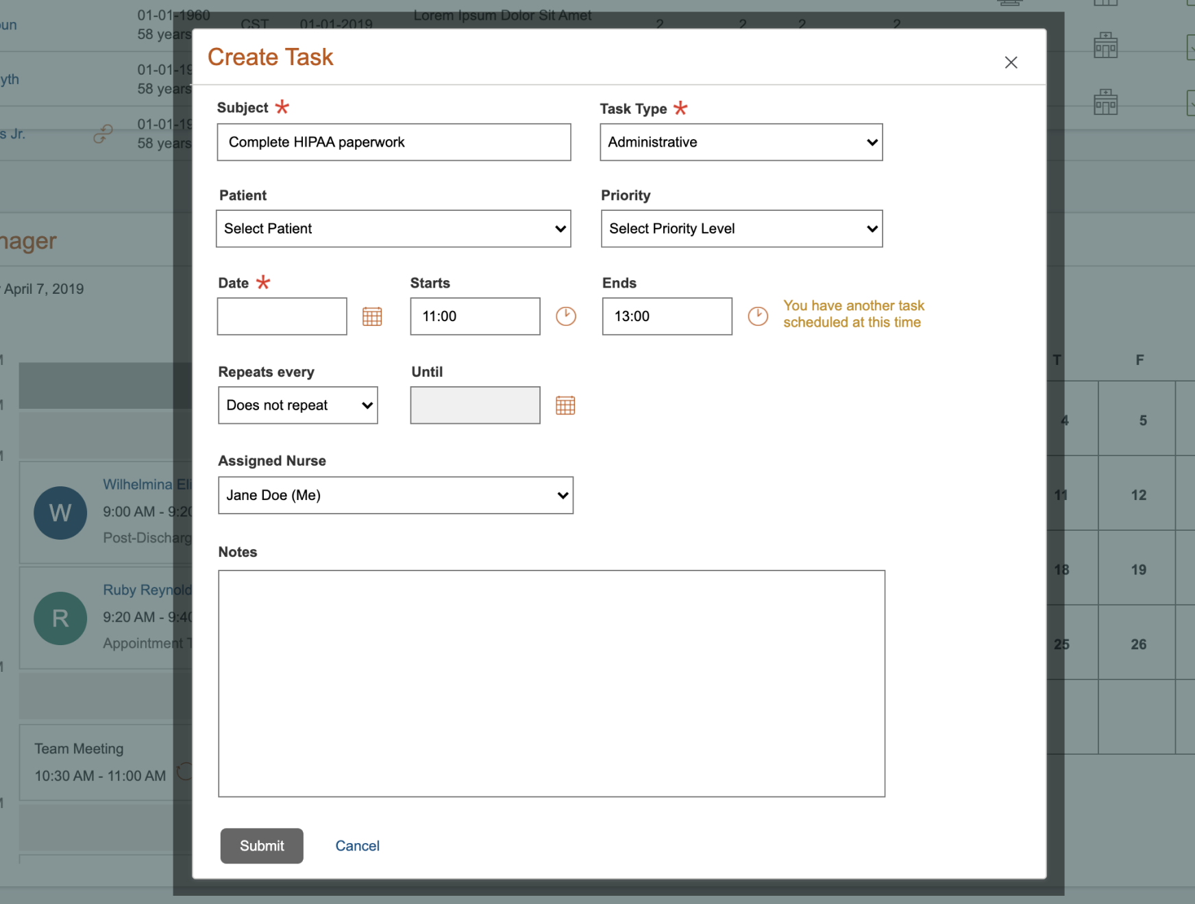
I split the new widget into two portions: 1) the user’s daily tasks and appointments, and 2) the monthly calendar, where users could jump ahead by weeks or months to view or set up appointments. To continue the goal of connecting all member-specific information, I linked appointments to the corresponding member’s profile. This had the added benefit of allowing nurses to easily take over appointments for colleagues who were out of office, as they could familiarise themselves with those members.
Initial feedback on version #1 was extremely positive, with users reporting that they used it on a daily basis to keep track of their appointments.
Based on user testing and feedback, I made some enhancements to the design. These included: adding a search feature to the calendar to filter by member, displaying a high-level overview of tasks on the calendar, adding a segmented control to filter available time slots in the user’s day, and showing a preview of any notes included for the daily appointments.
Feature #3: Programs and Referrals
Context
Members can be referred to multiple wellness programs at one time, particularly if they have numerous comorbidities. However, a member can only be enrolled in one program at any one time; these programs are ranked in a hierarchy according to the severity of the condition they treat. These referrals were stored on a different system, so the goal was to bring that data stream into NC2.0.
Referrals have to be acted on within a number of days or they are automatically rejected.
As the Priority Roster is sorted based on member priority, I added a separate Referrals tab to ensure that new referrals were not missed.
I also created a widget on the individual member profile, combining any programs that the member was enrolled in, as well as any new referrals. Here, the user could keep track of outreach attempts to the member, as well as view the member’s program history and outreach history, so that nurses could track programs that a member had previously been enrolled in or already expressed disinterest in joining.
Solution
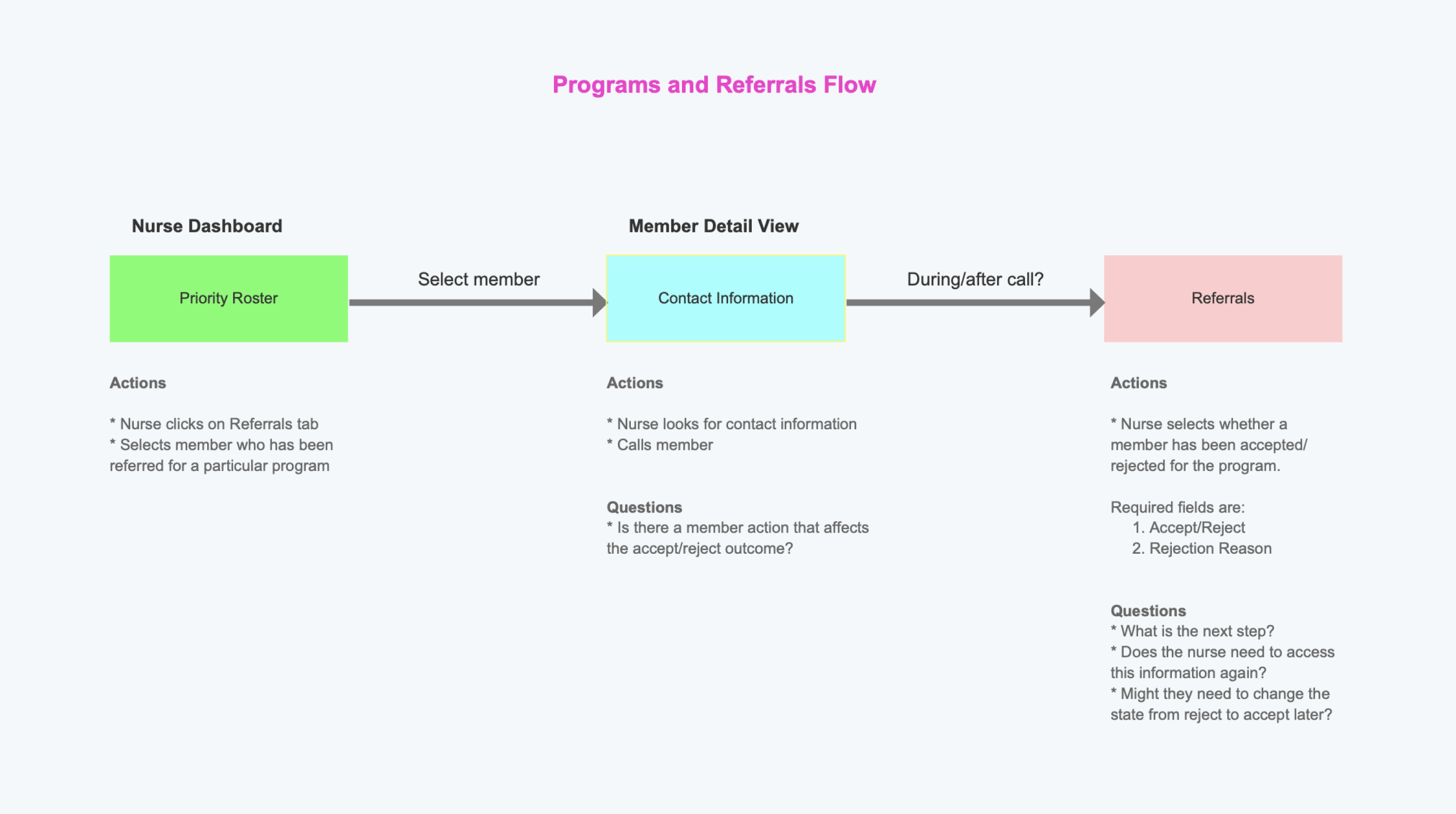
Initial user flow, based on needfinding sessions

Early interactive prototype for testing

Final prototype of P&R member widget

Final prototype of associated referrals tab in the Priority Roster
Feature #4: Alerts Banner
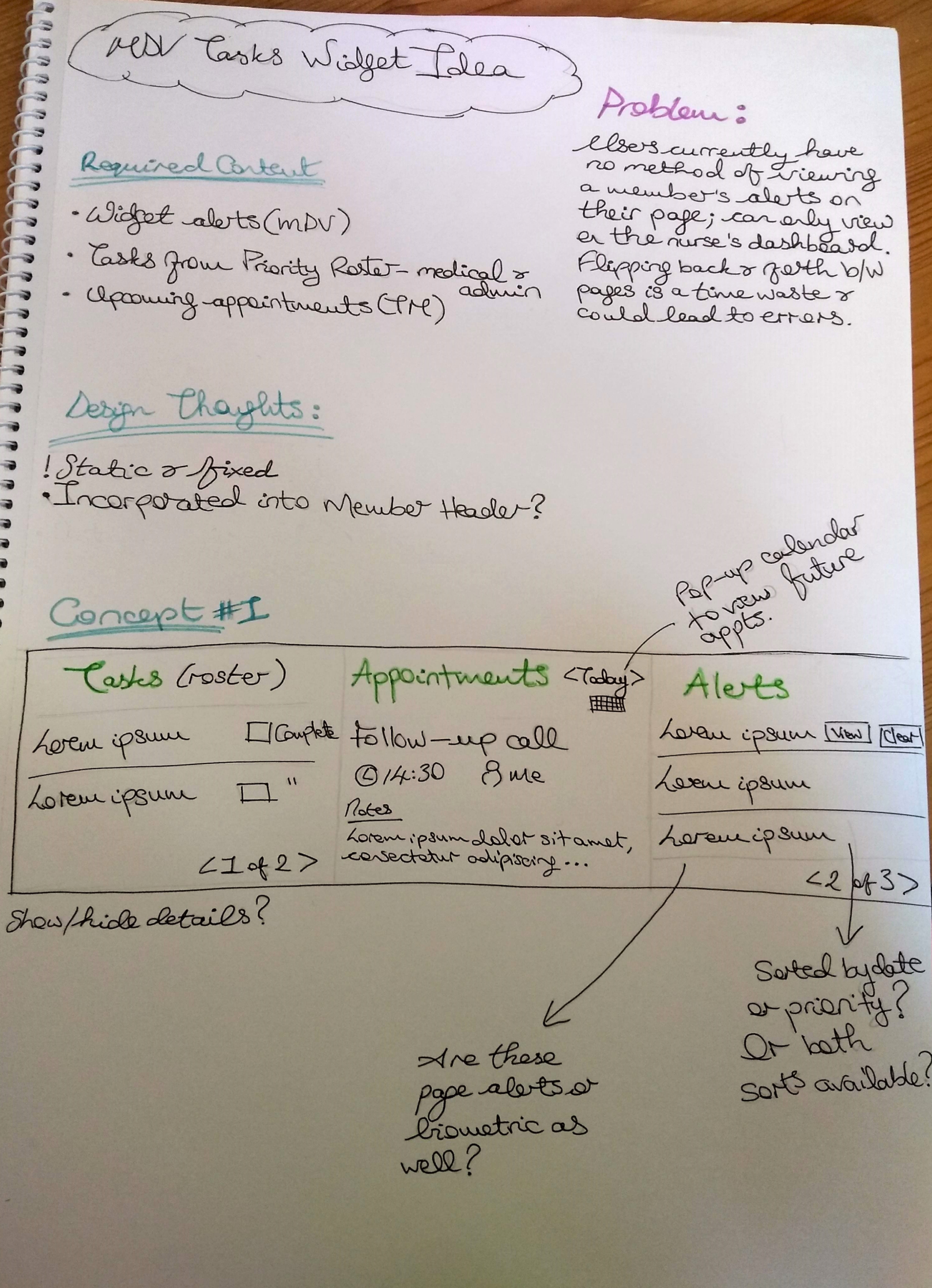
This feature was a concept that I personally pitched to the business, and was one of the last designs that I created on NC2.0.
At this time, users could only view member-specific biometric alerts and admin tasks in the Priority Roster, not the in member’s actual profile. In addition, they could only view upcoming appointments related to a member in the Task Manager (also in the dashboard). This created an unnecessary burden on the user to remember these details about the member, or to spend more time switching back and forth between pages.
Given the importance and time-sensitivity of much of this data, I wanted to ensure that it was easily accessible. There was already a static header banner in the member profile, so I incorporated the design into this.
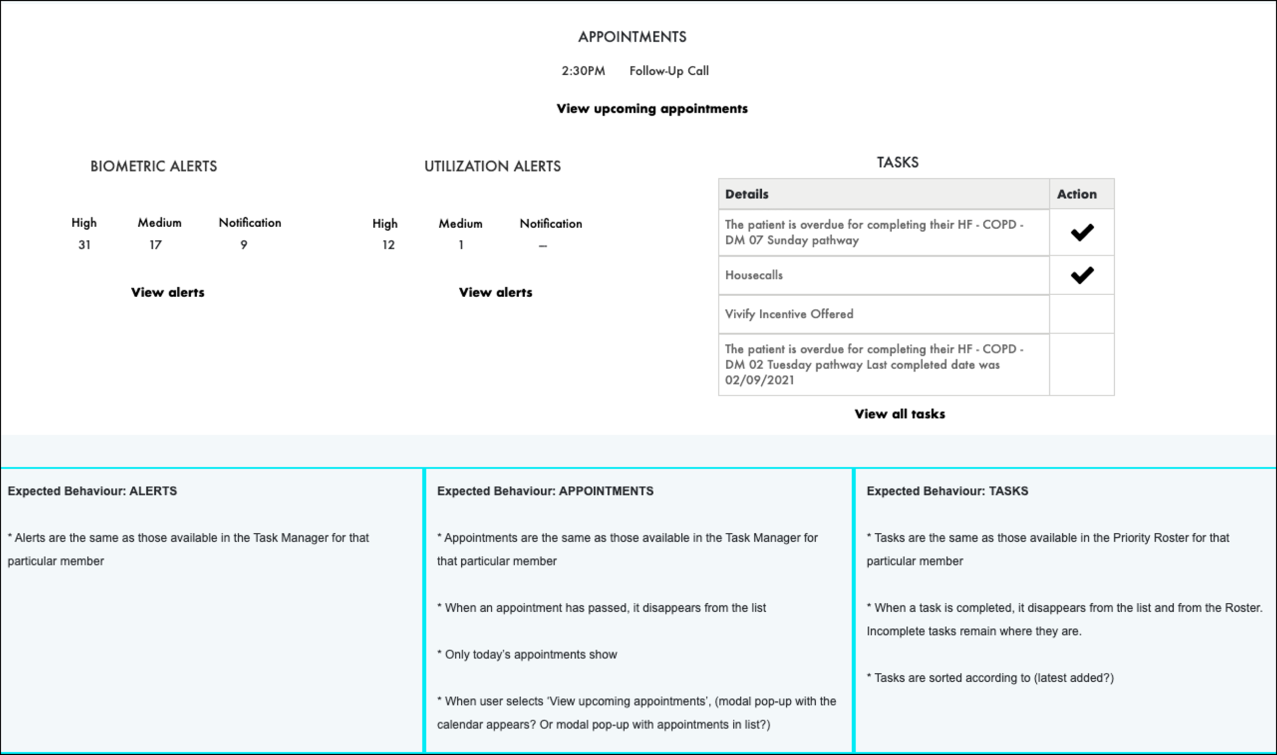
Lo-fi wireframe

Higher fidelity mockup
Key Takeaways and Learnings
Overall, the features I designed were well-received and enabled the users to achieve their goals of reducing number of clicks, improving navigation and preventing rework.
Commuication is key on any project, and especially on one this large with so many moving parts. Equally important is building trust with the users and letting them know that their opinions matter. I was fortunate to accomplish this, as was reflected in my conversations with the users, particularily when they started to reach out to me outside of our regular sessions to suggest new ideas.
I also learned the power of subjectivity when it came to translating asks from users, and that requirements (example of ___)
Most of the analysis that I conducted on this project was qualitative; a separate team were building a feature to gather and analyse quantitative site metrics, but it remained in their backlog for a long time. I believe this should have been a much higher priority, as we were often relying on users to tell us what was wrong and were likely missing other less-evident problems, as well as opportunities for improvement. In future projects, I will push more for this to be a priority from the beginning.
Design Tools Used
Axure v8 and v9
Internal design kit

